Logo
Logo
Our DesignShop logo is easily recognizable, and we maintain its iconic status by consistently applying it with proper placements, clear space, and color treatments in any context.
Overview
The DesignShop wordmark features precise, geometric letterforms that imbue it with a professional essence, making it distinctive and unique to the brand.
Clearspace
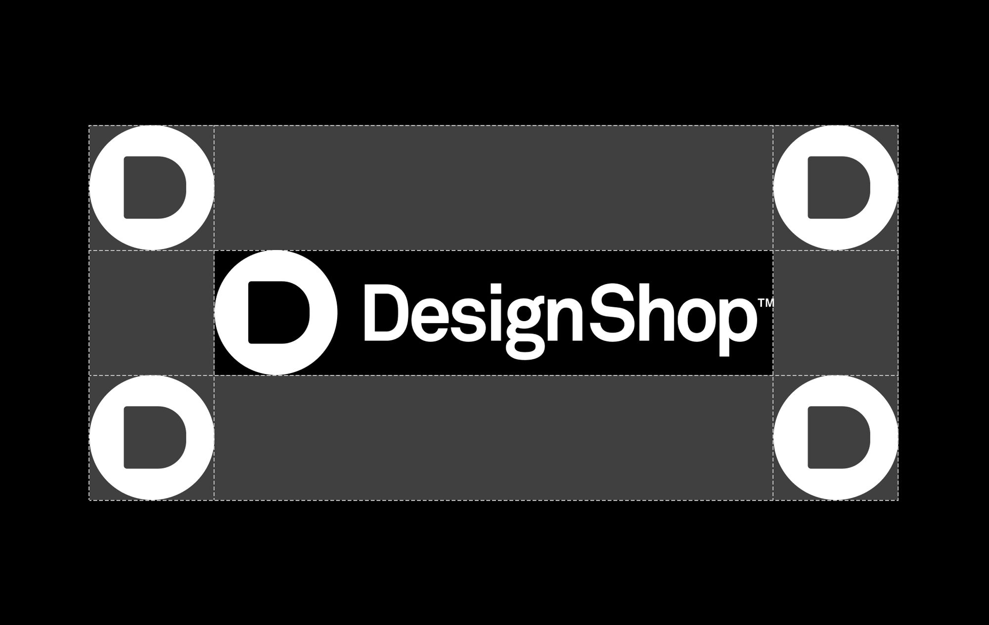
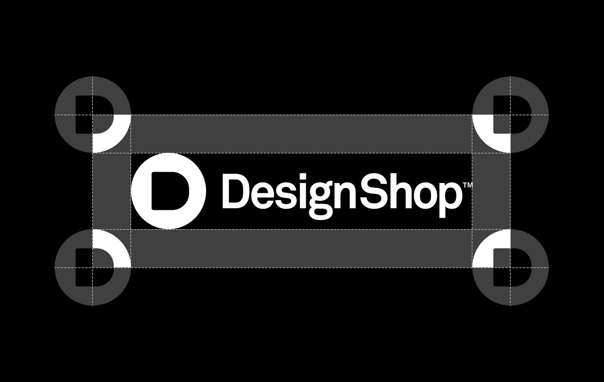
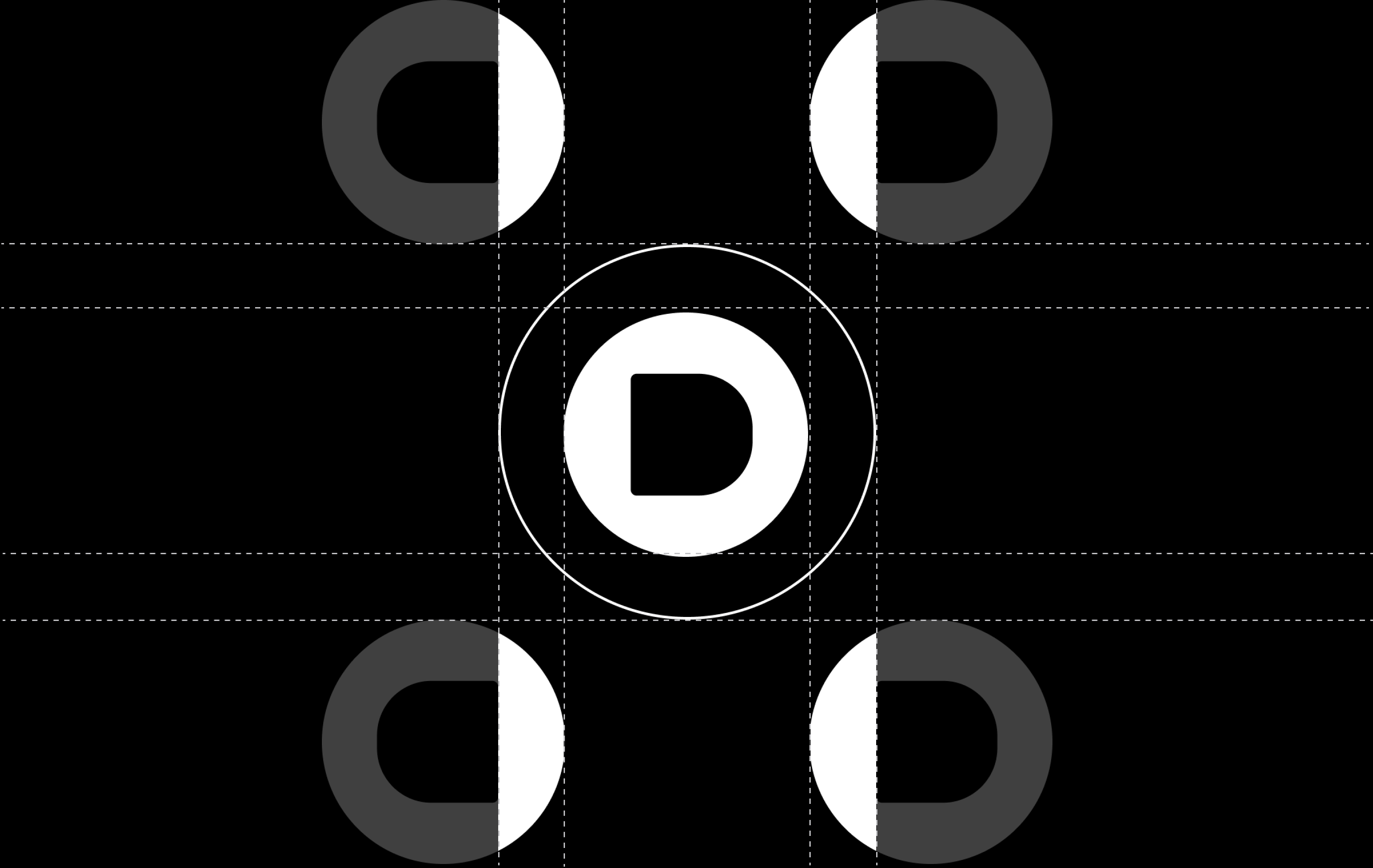
When applying our logo, it is paramount that it is given enough space from the margins and other elements on the page. Two clear spaces have been developed that shift in size depending on the size of the mark. Everything starts with the logo.


Symbol
The DesignShop emblem showcases a crisp and distinct letter "D," which can be easily associated with the brand and possesses a clean and distinctive quality.
Placement
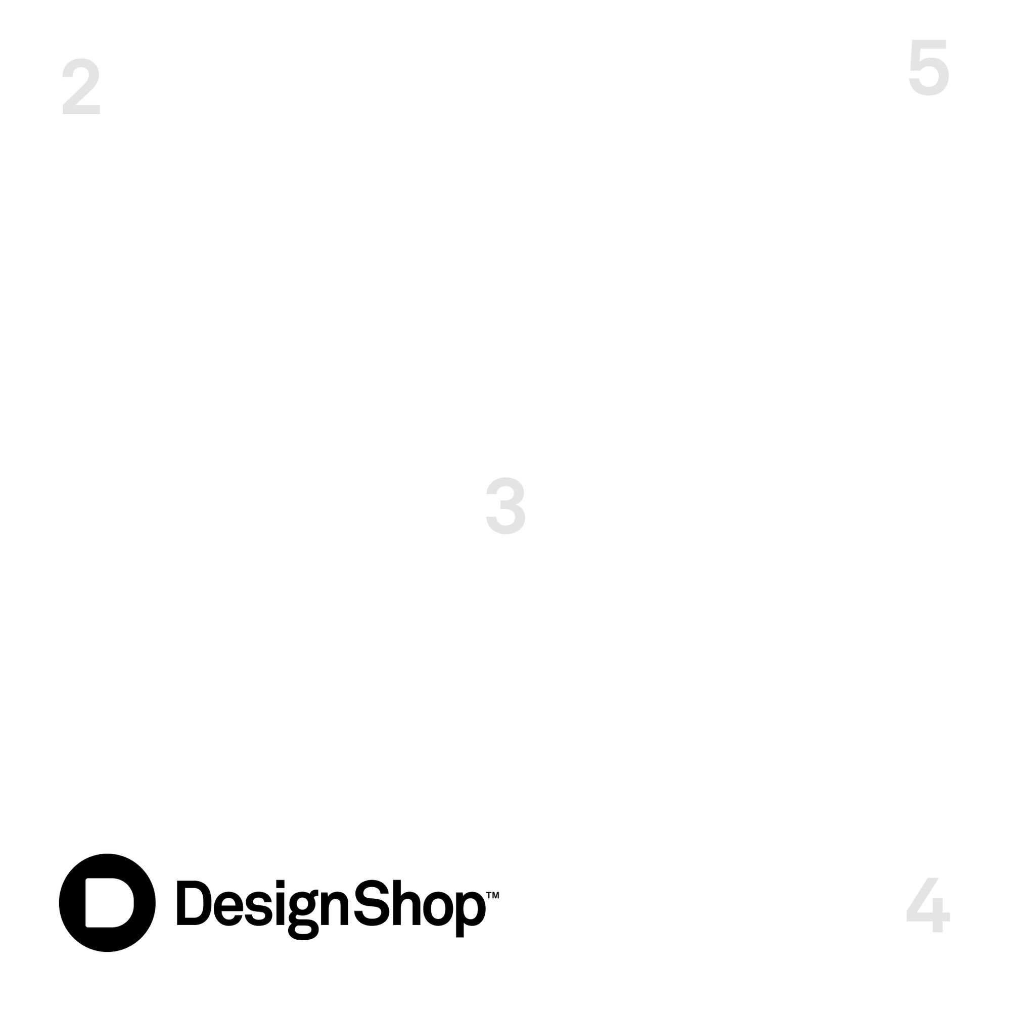
There are five main placement options when it comes to the DesignShop logo. This offers flexibility when applying the logo across various applications.
Scalability
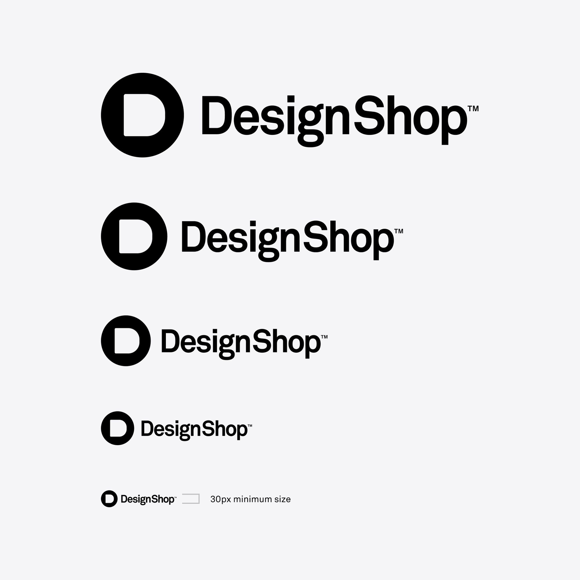
The DesignShop logo was designed and tested to work at various sizes. The minimum logo size for adequate legibility is 30px in height. Never go smaller than this. Establishing a minimum size helps ensure that the logo's legibility is never compromised.
Color options
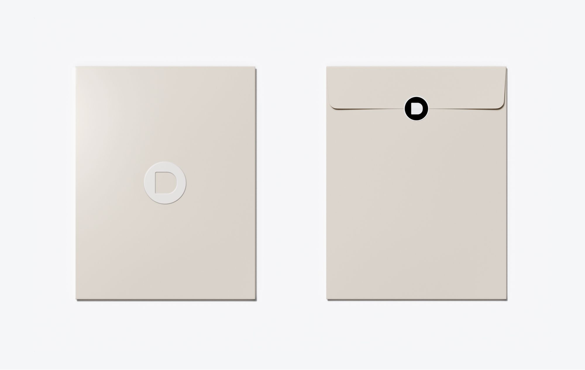
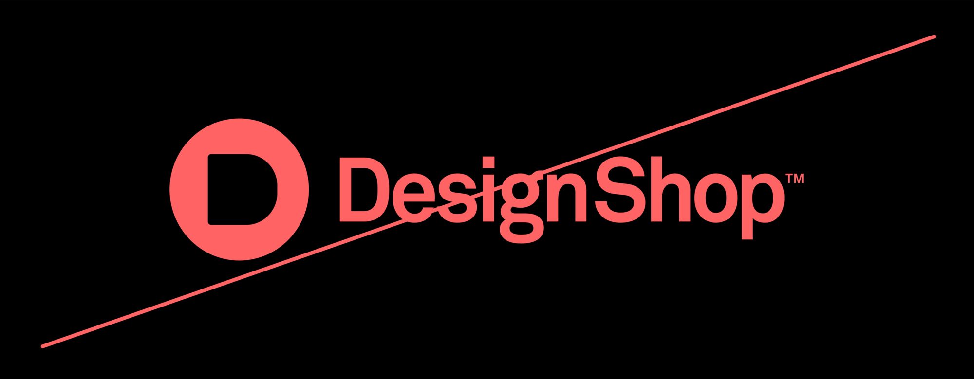
The DesignShop logo should only be used in black or white. When applying the logo over imagery, always ensure there is enough contrast between the logo and the image to make the logo clearly legible. See Color section for more information.


Logo misuse
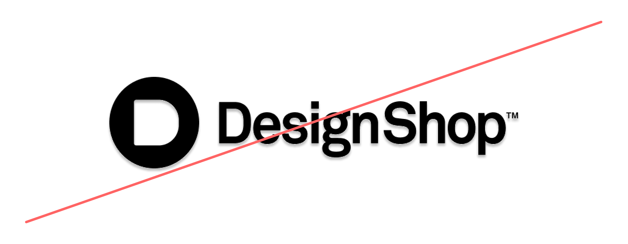
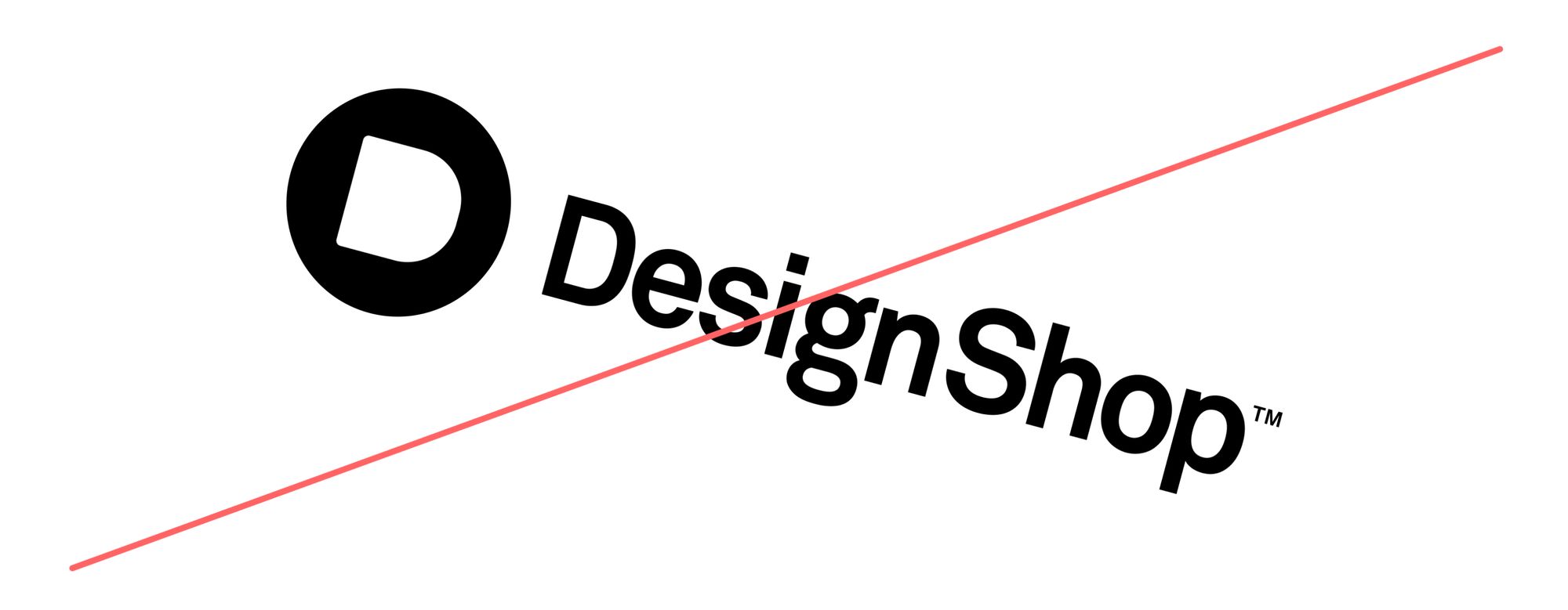
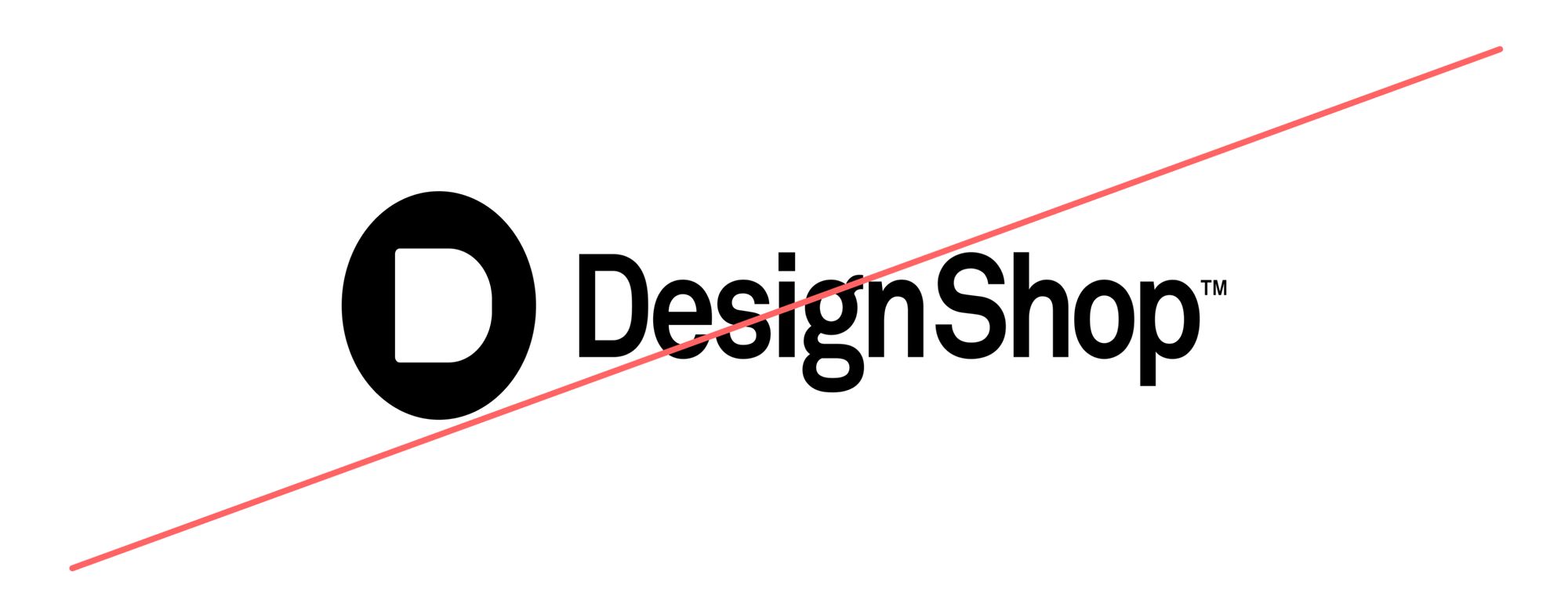
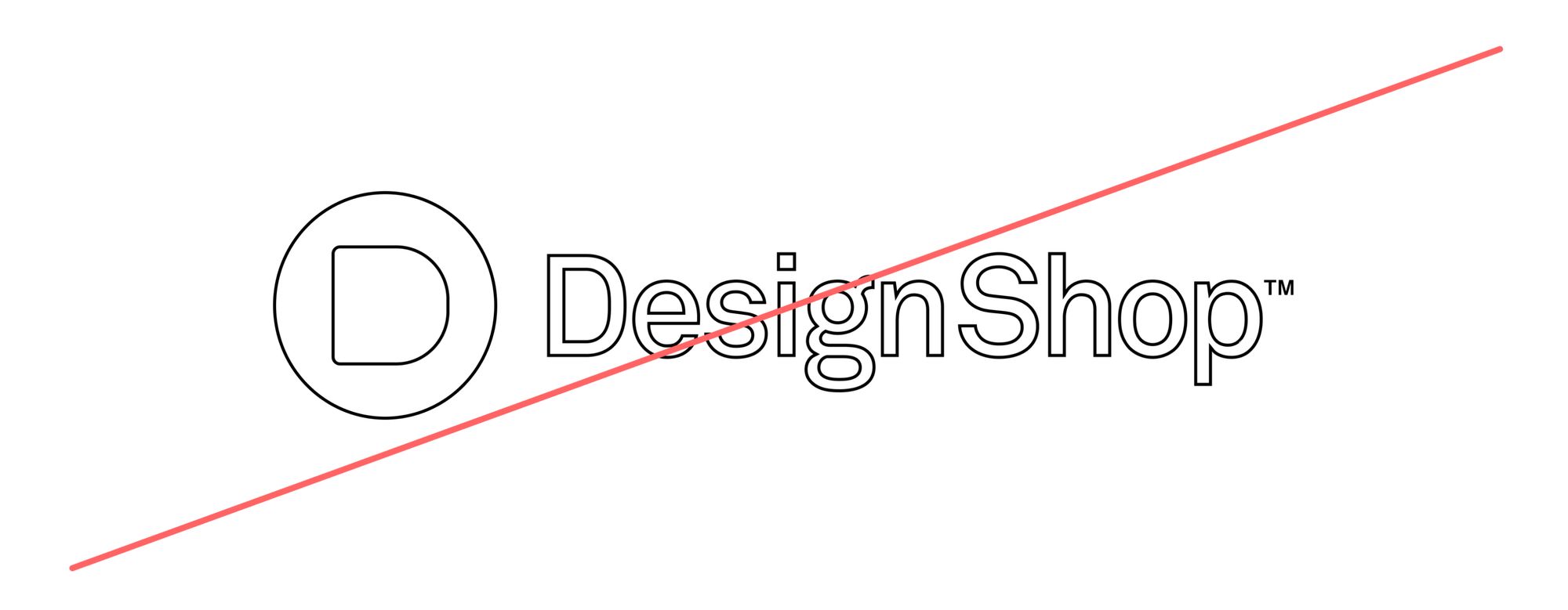
It is important that the appearance of the logo remains consistent. It should not be reinterpreted, modified, or embellished. No attempt should be made to alter the logo in any way. Below are some mistakes to avoid.

Logo as typeface
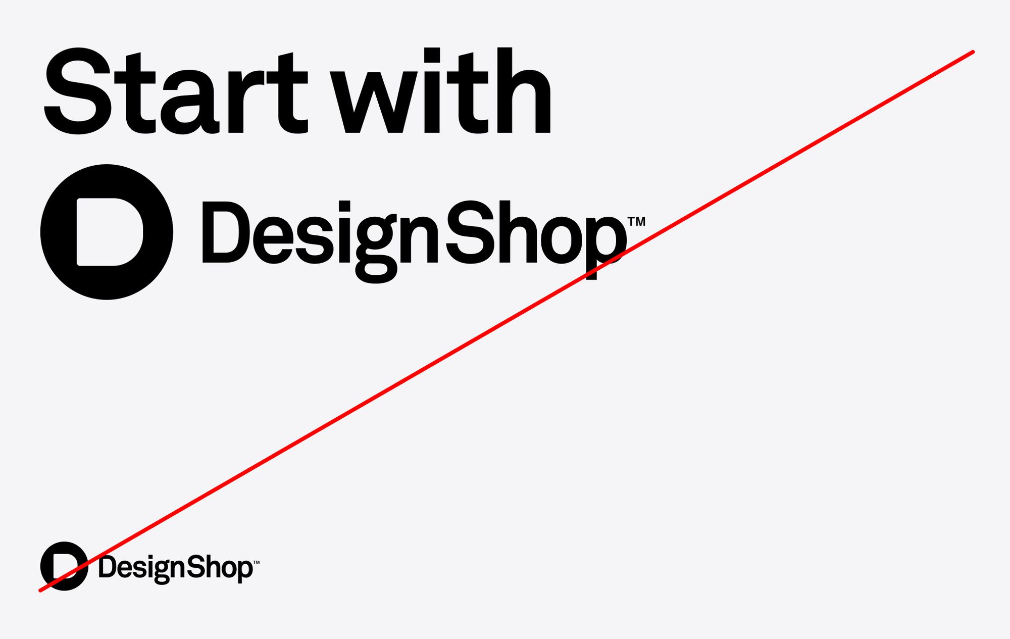
In many cases, we will need to refer to DesignShop within a sentence or paragraph. Never use the logo in these situations. Always use our brand typeface, Akkurat, in the same weight as the rest of the copy.

Icons
The construction of icons must respect clear space and give the logo enough room to stand out.

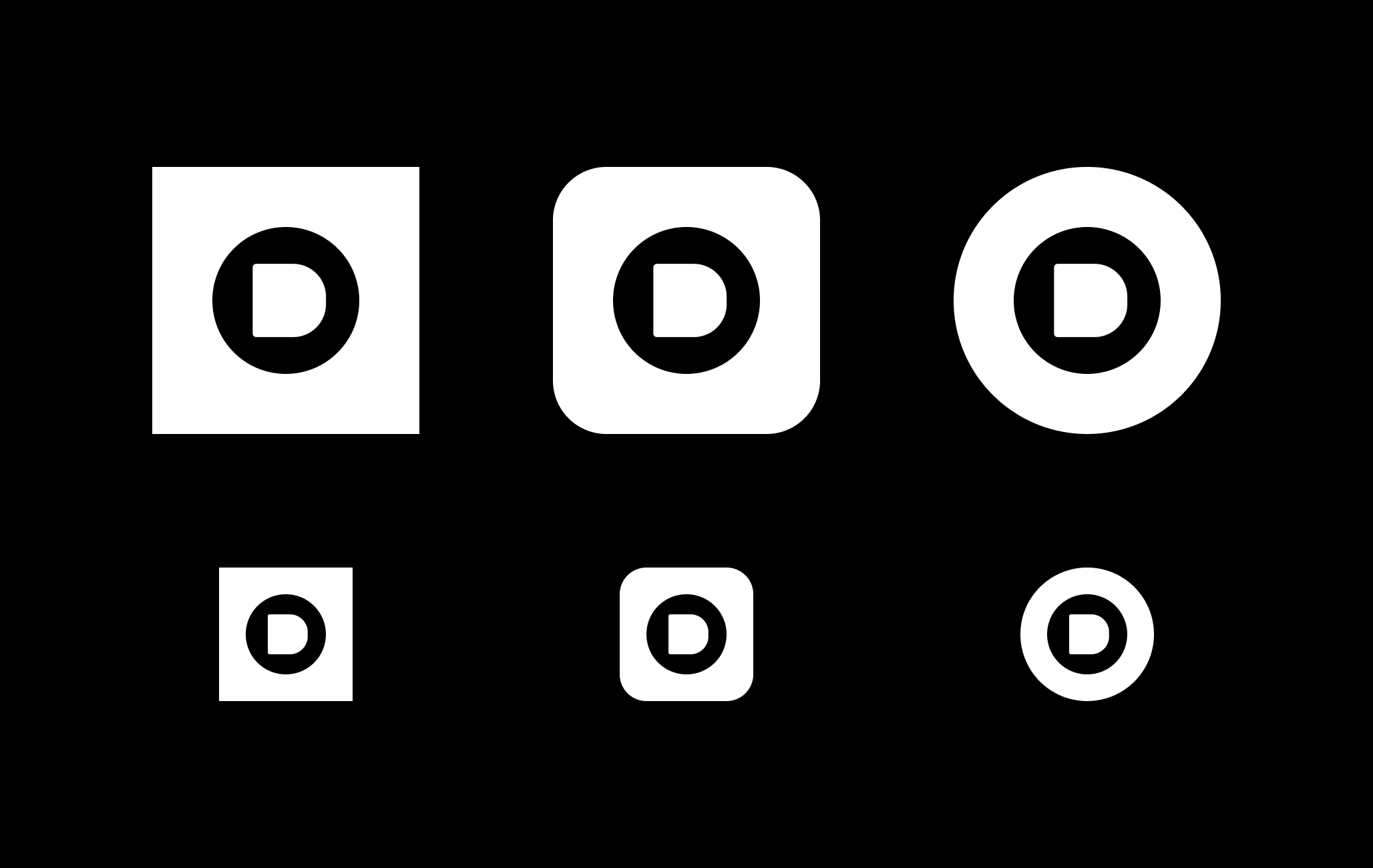
Application examples
