Typography
Typography
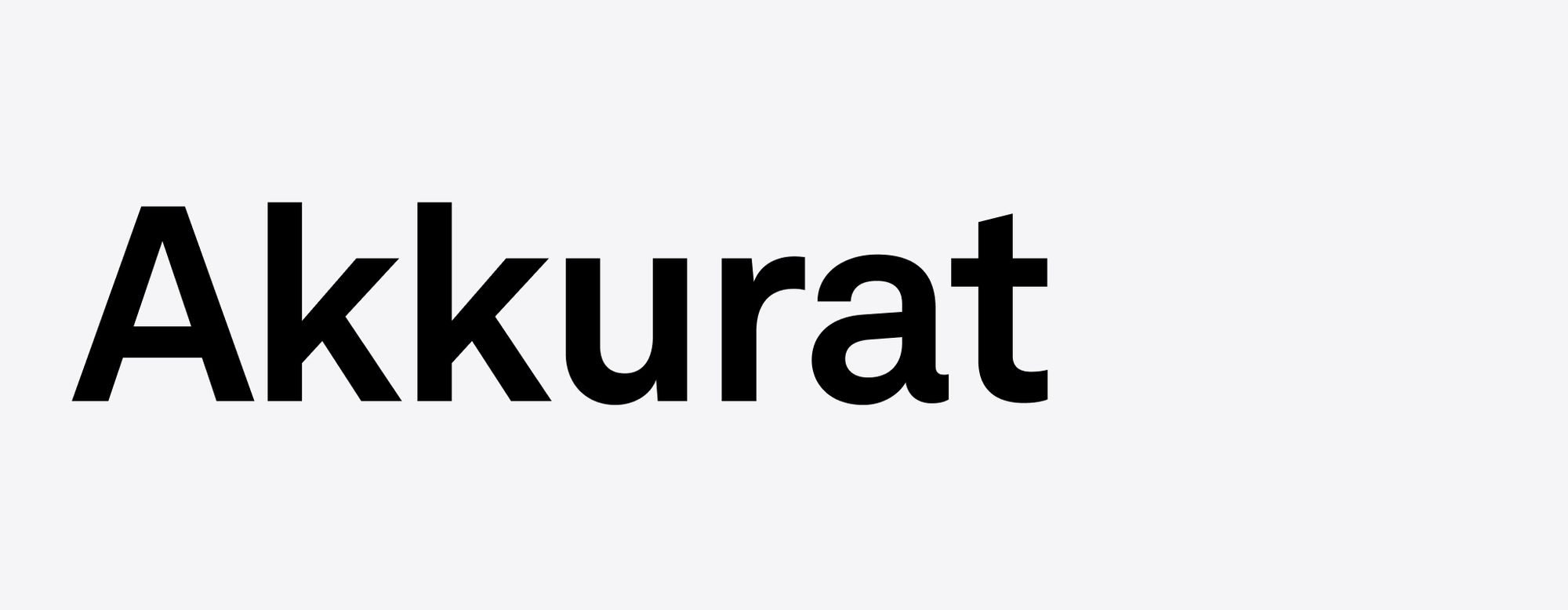
Our type is modern, flexible, and rational, conveying information in a clean and simple way without being distracting or obtrusive. Our typeface is called Akkurat.
Overview
Akkurat is a grotesque sans-serif typeface designed by Swiss designer Laurenz Brunner. It was released in 2004 through the Lineto type foundry.
To obtain a copy of the typeface or if you have questions regarding licensing, please reach out to the DesignShop Brand Team.
Character set
This is what Latin characters look like in Akkurat. This typeface also supports Arabic, Cyrillic, Hebrew, and Greek characters. For other alphabets, designers and developers should use the closest available approximation.
Uppercase
Lowercase
Numerals and Fractions
Akkurat also contains:
- Accented Uppercase
- Accented Lowercase
- Punctuation
- Numerators, Denomerators
- Symbols
- Mathematical Symbols
- Currencies
Weights
Akkurat supports a wide range of widths and weights. Our brand identity uses only Akkurat Regular and Akkurat Bold.
Weights
Usage
See examples below of weights in situ. In general, use Akkurat Bold for any copy larger than 20px in size. For anything smaller, use Akkurat Regular to maximize legibility and clarity.
Headlines
Akkurat Bold
Dolor sit amet
Consectetur
Subheaders, Short Paragraphs
Akkurat Bold
Bodycopy
Akkurat Regular
Bodycopy Small
Akkurat Regular
Setting type
Alignment
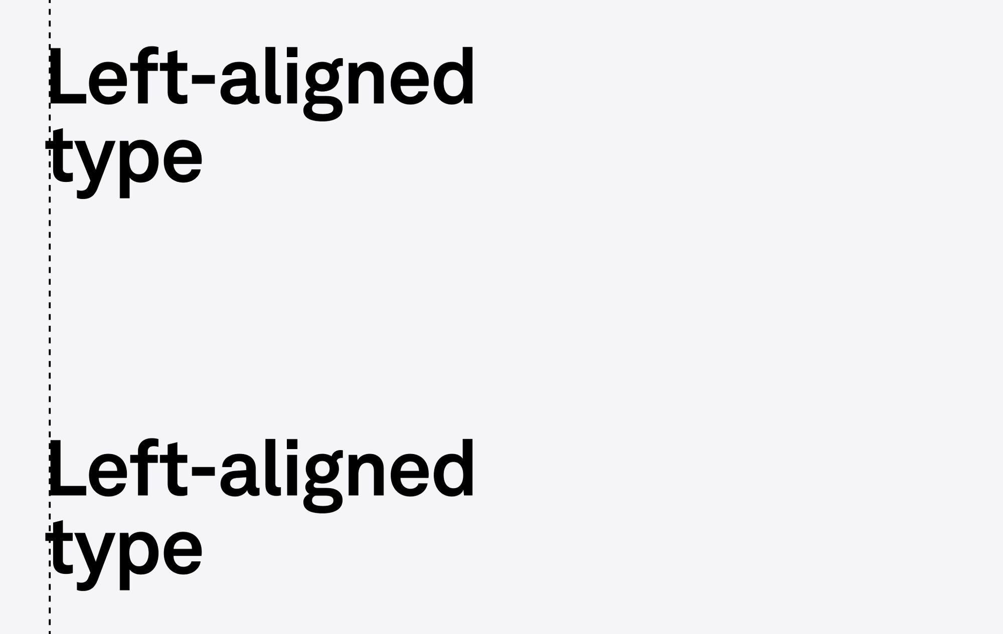
Setting type in a way that is clear, clean, and authoritative is crucial to a positive user experience. Here you’ll find some rules that dictate how copy should look.
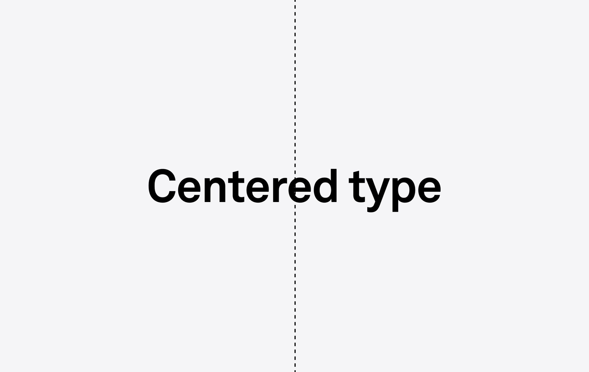
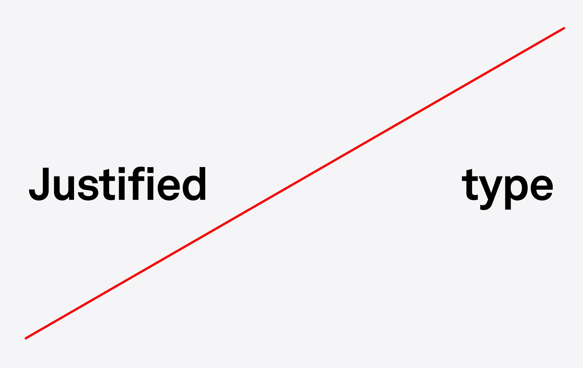
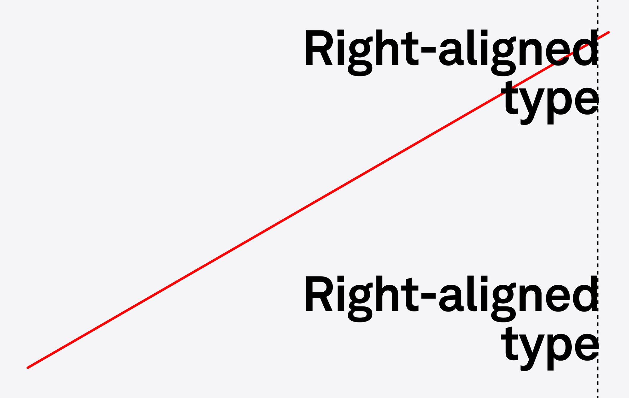
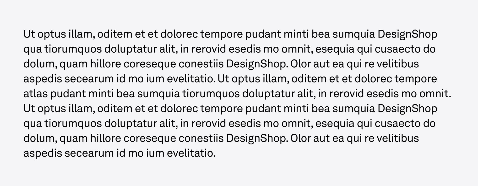
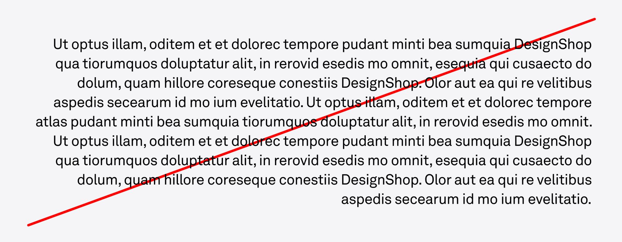
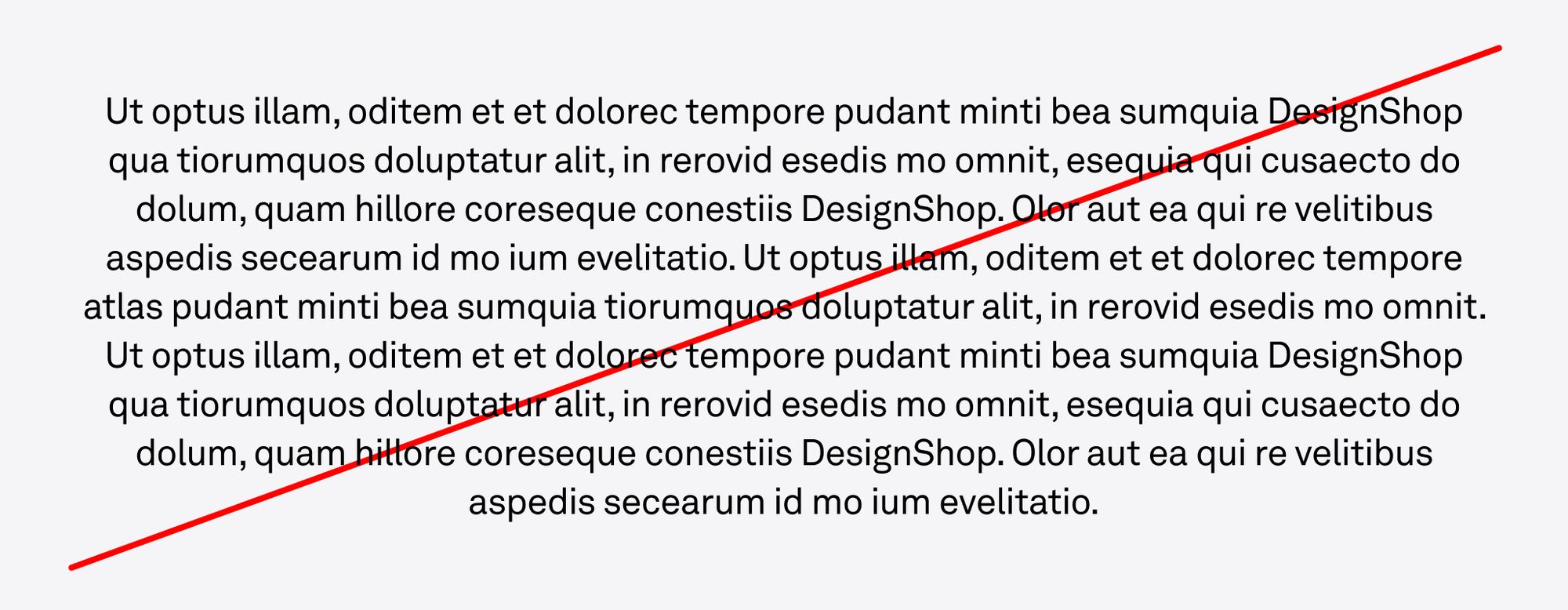
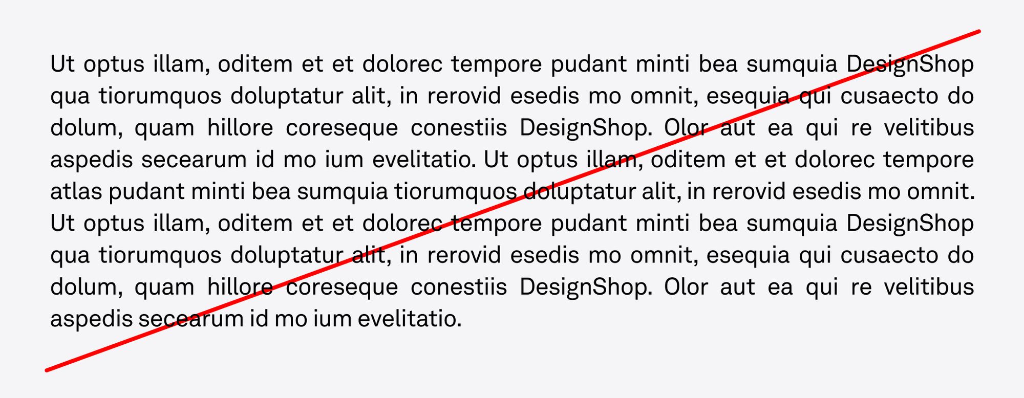
Setting type
Margins
Our margins are dictated by the logo clear space, which varies based on the size of the logo. Once the margins have been set, make sure typography is aligned with them.
Setting type
Tracking
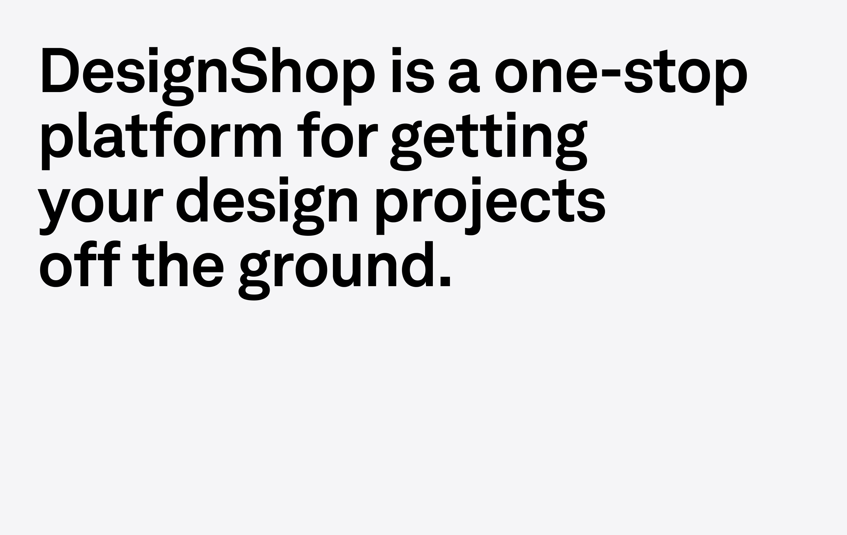
Tracking is the amount of space given to an entire group of letters in a word. Tracking should generally be tight, but very loose or very tight tracking should be avoided. Below are some examples to help guide tracking.
Too tight
Tracking -5%
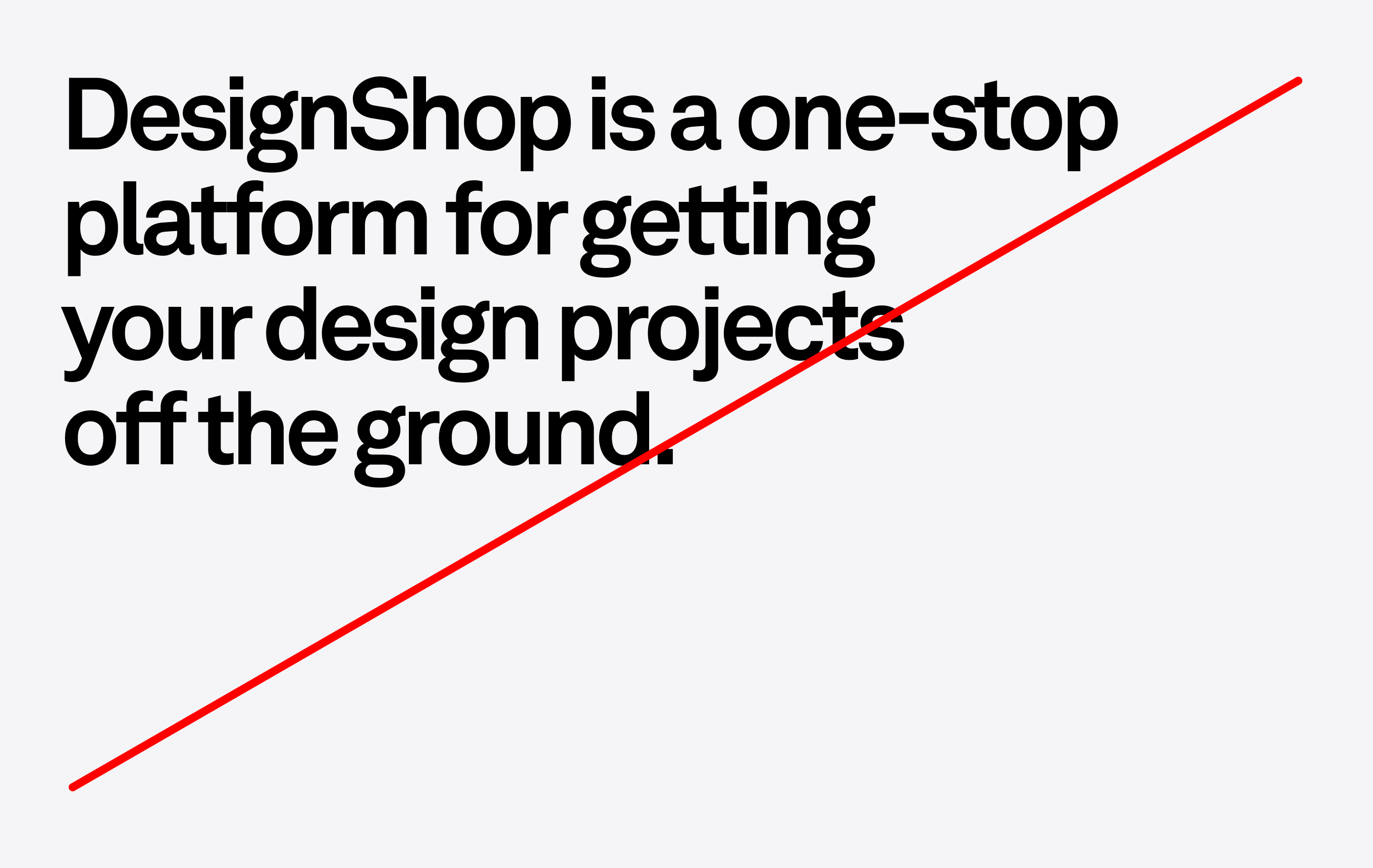
Too loose
Tracking +1%
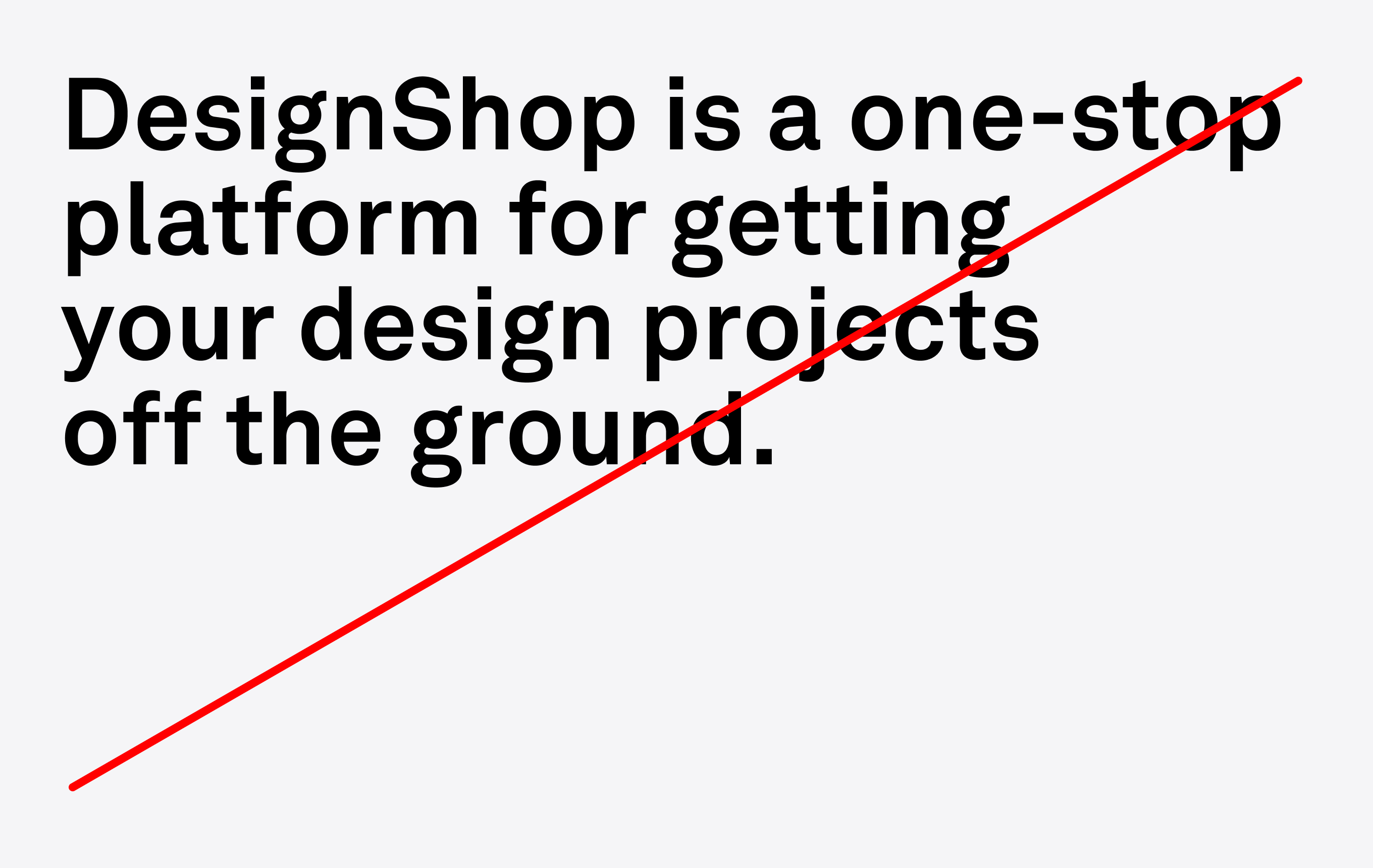
Just right
Tracking -2%
Setting type
Leading
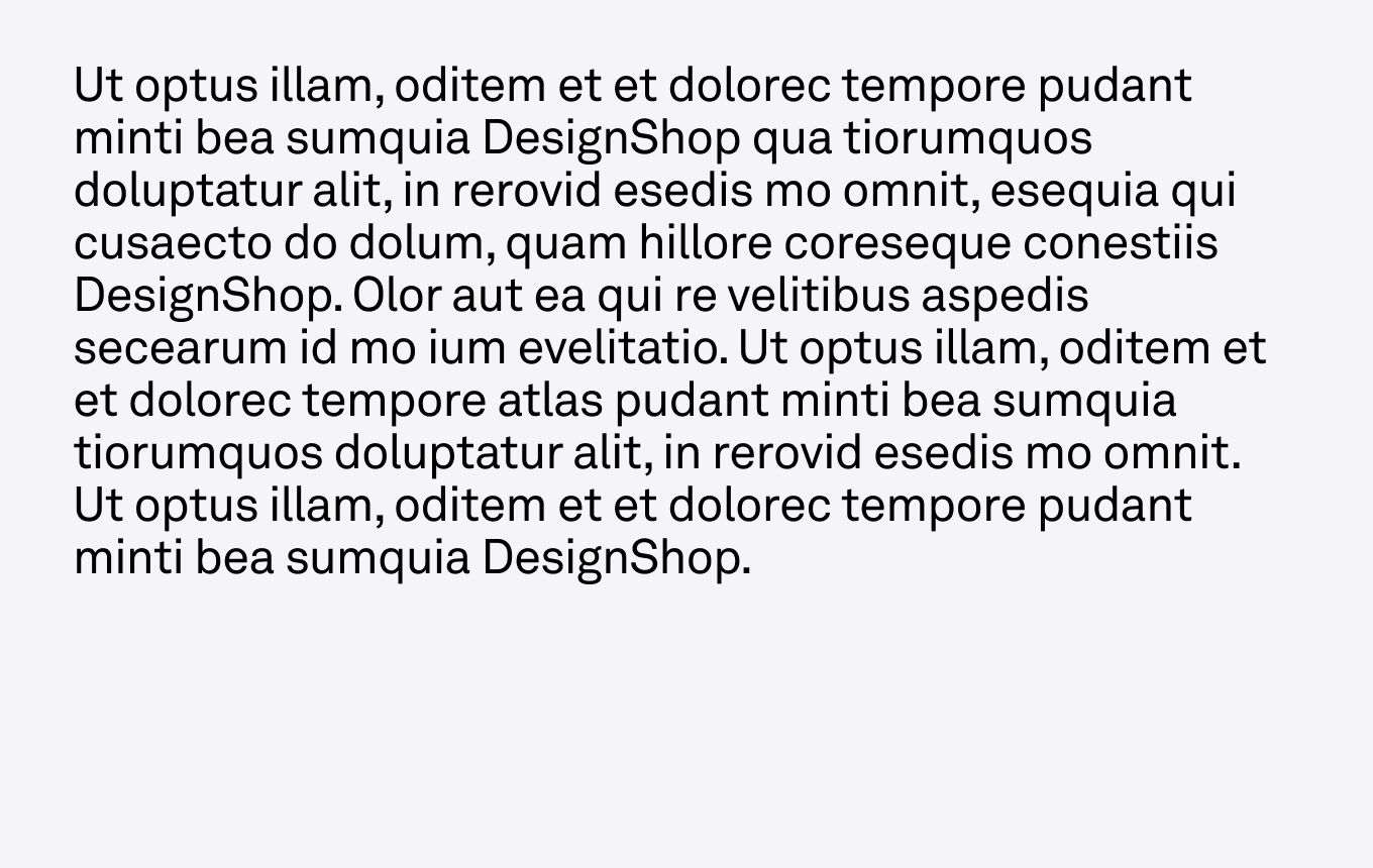
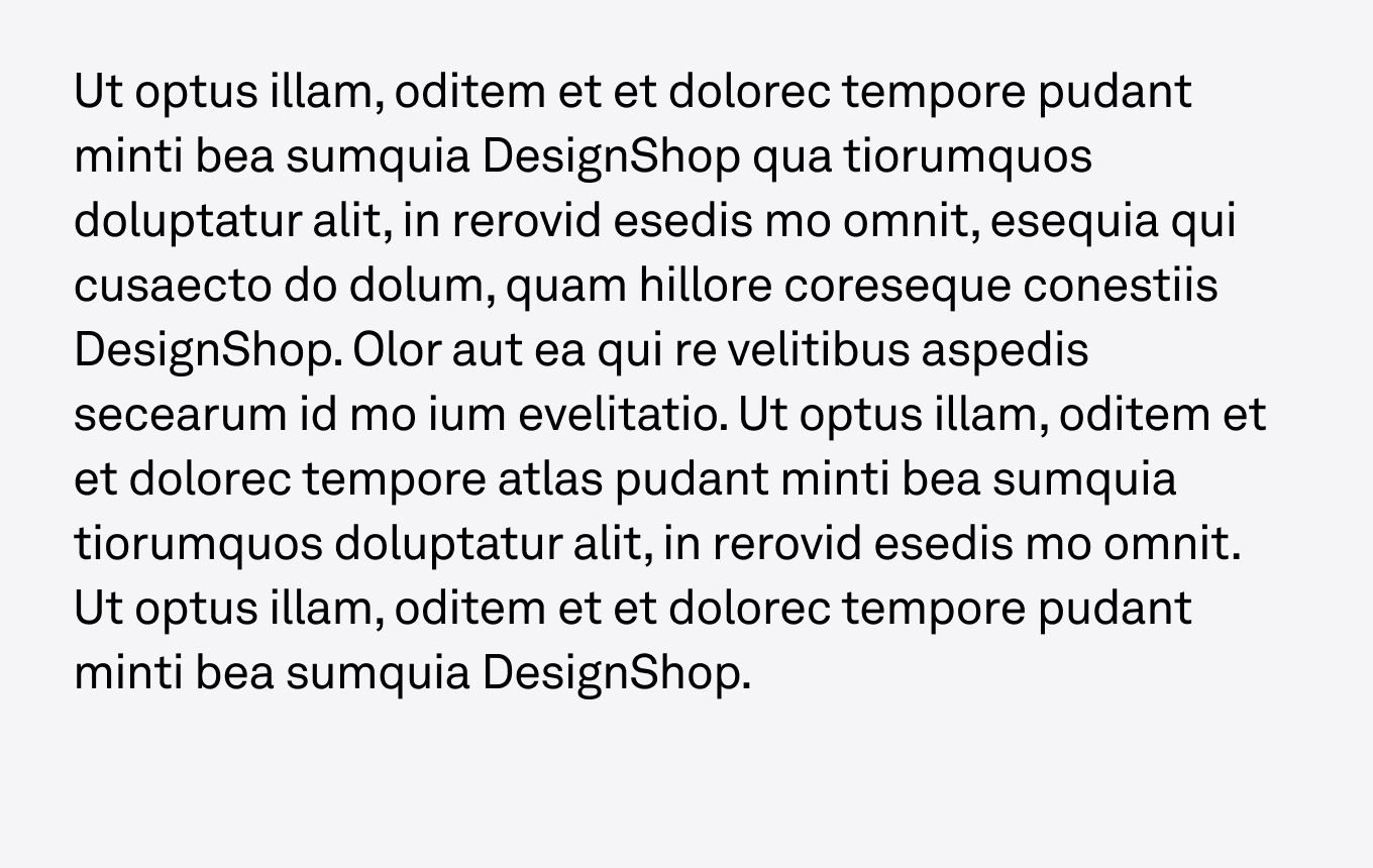
Leading is the space between lines. The visual effect of leading should always be optically greater than the word spacing, which should always be optically greater than the tracking. This will prevent words from being read out of order and keep the eye from jumping around the page.
Too tight
Leading 24/26
Too loose
Leading 24/36
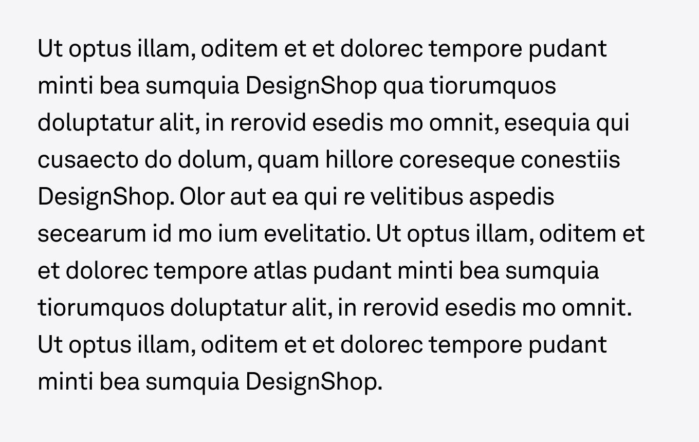
Just right
Leading 24/32
Setting type
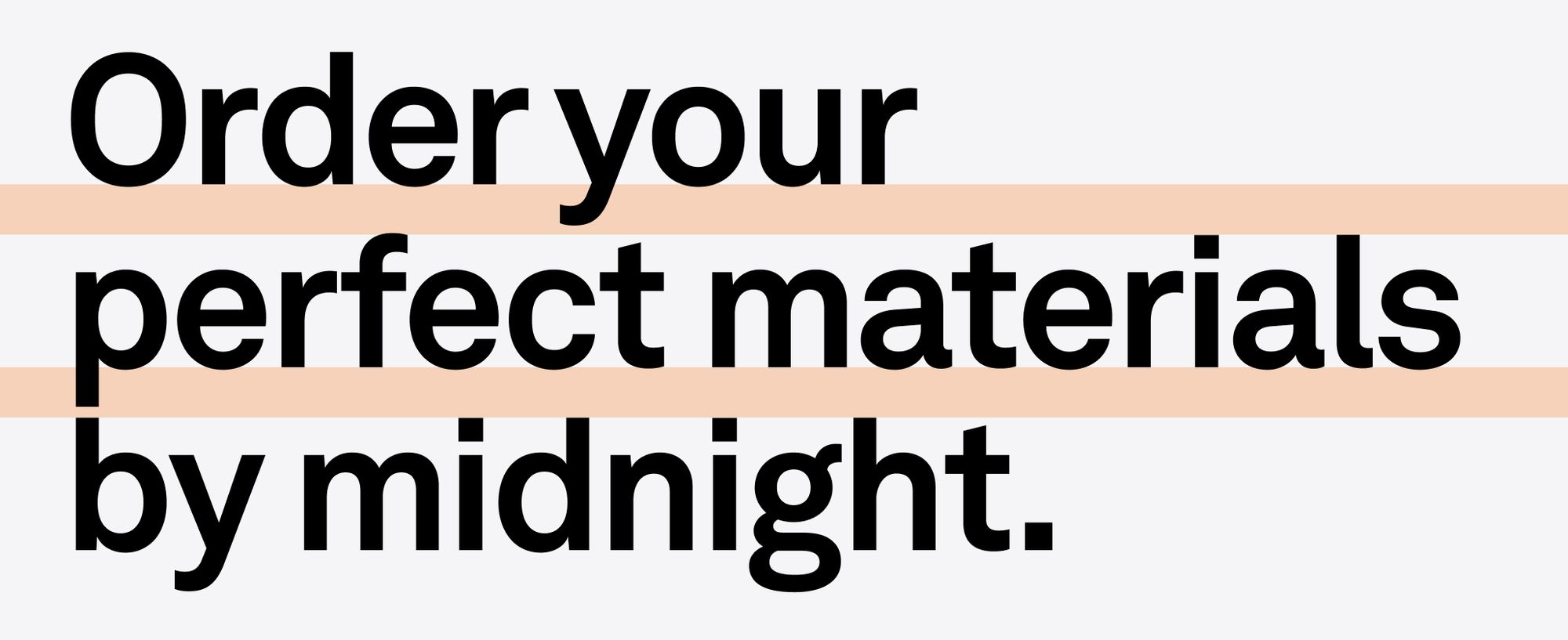
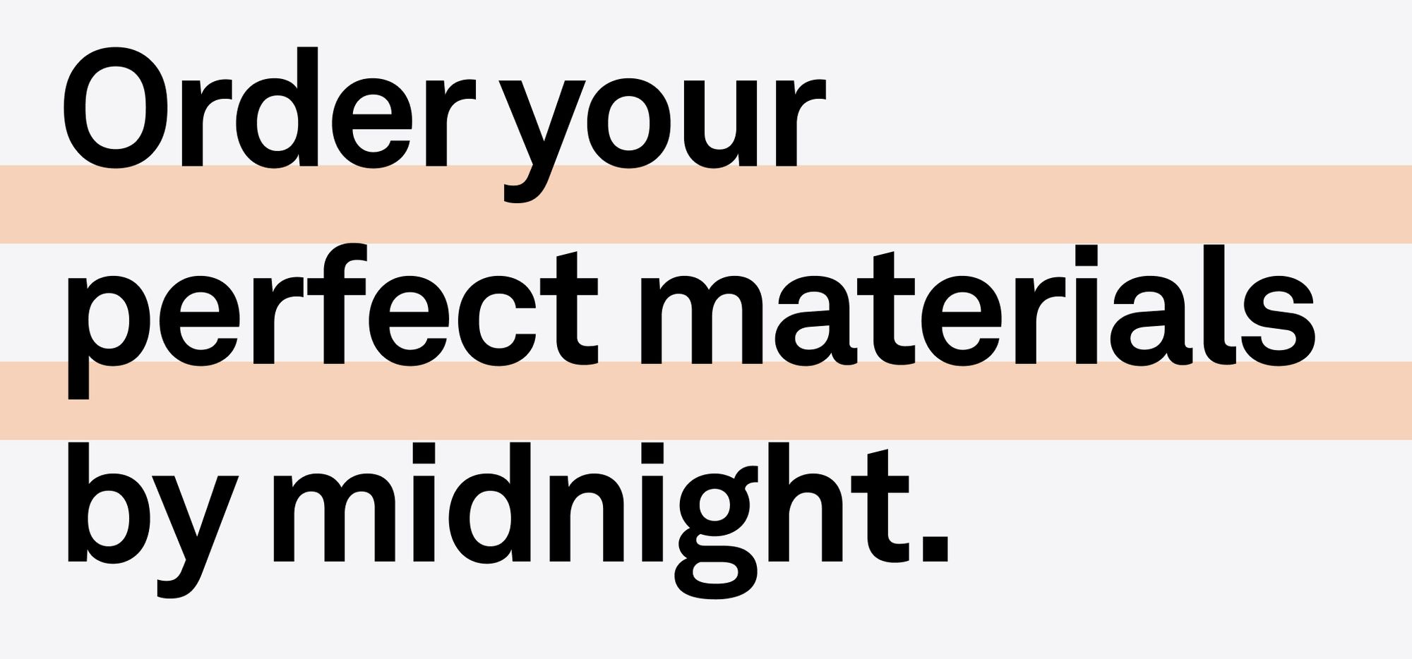
Headline leading
Desired leading 120/100
Acceptable leading 120/120
Setting type
Examples
Below are examples of kerning, tracking, and leading all working together. Notice how the bigger the type is, the tighter the tracking and leading become relative to the type size. These elements become looser with smaller type to maximize legibility.
Size 100pt
Leading 90pt
Tracking -3%
This is a title example.
Size 60pt
Leading 54pt
Tracking -2%
This is a subtitle example.
Size 24pt
Leading 30pt
Tracking 2%
This is a body copy example, lorem elit adipiscing elit, sed do eius mod tempor incididunt ut labore et dolore magna qua aliqua. Ut enim ad minim veniamquis ex nostrud exercitation ullamco.
Size 16pt
Leading 22pt
Tracking -2%
This is a small copy example, lorem elit adipiscing elit, sed do eius mod tempor incididunt ut labore et dolore magna qua aliqua. Ut enim ad minim veniamquis ex nostrud exercitation ullamco.
Setting type
Capitalization
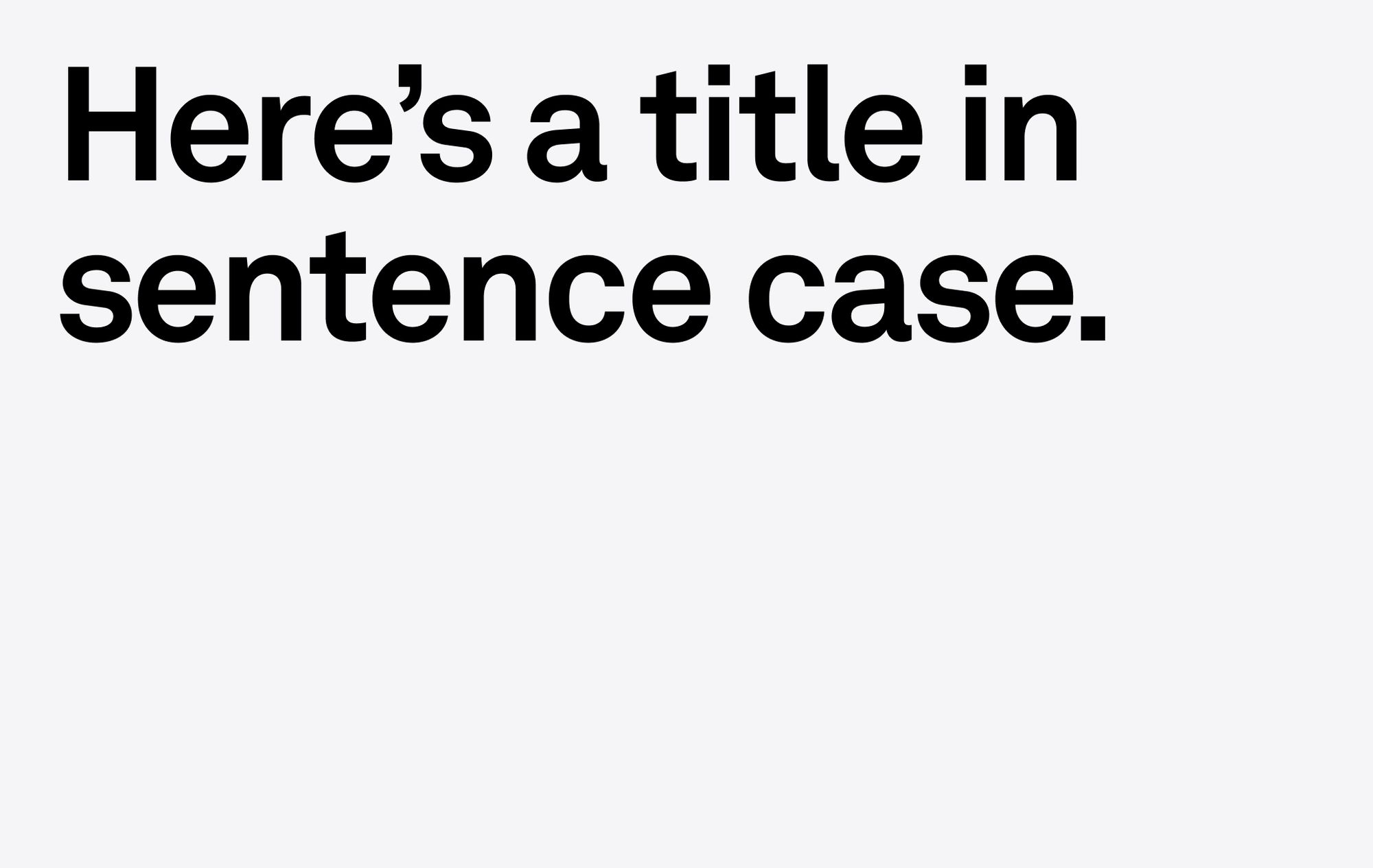
We generally use sentence case for all headlines, subheaders, and body text — the first letter of the first word and proper nouns should be capitalized.
Setting type
Don’ts
There will undoubtedly be occasions where a type problem arises that isn’t addressed in this toolkit. In these cases, refer to the guidelines as much as possible and try to find a solution that feels consistent with the overall brand. Below are some things that should always be avoided when setting type.
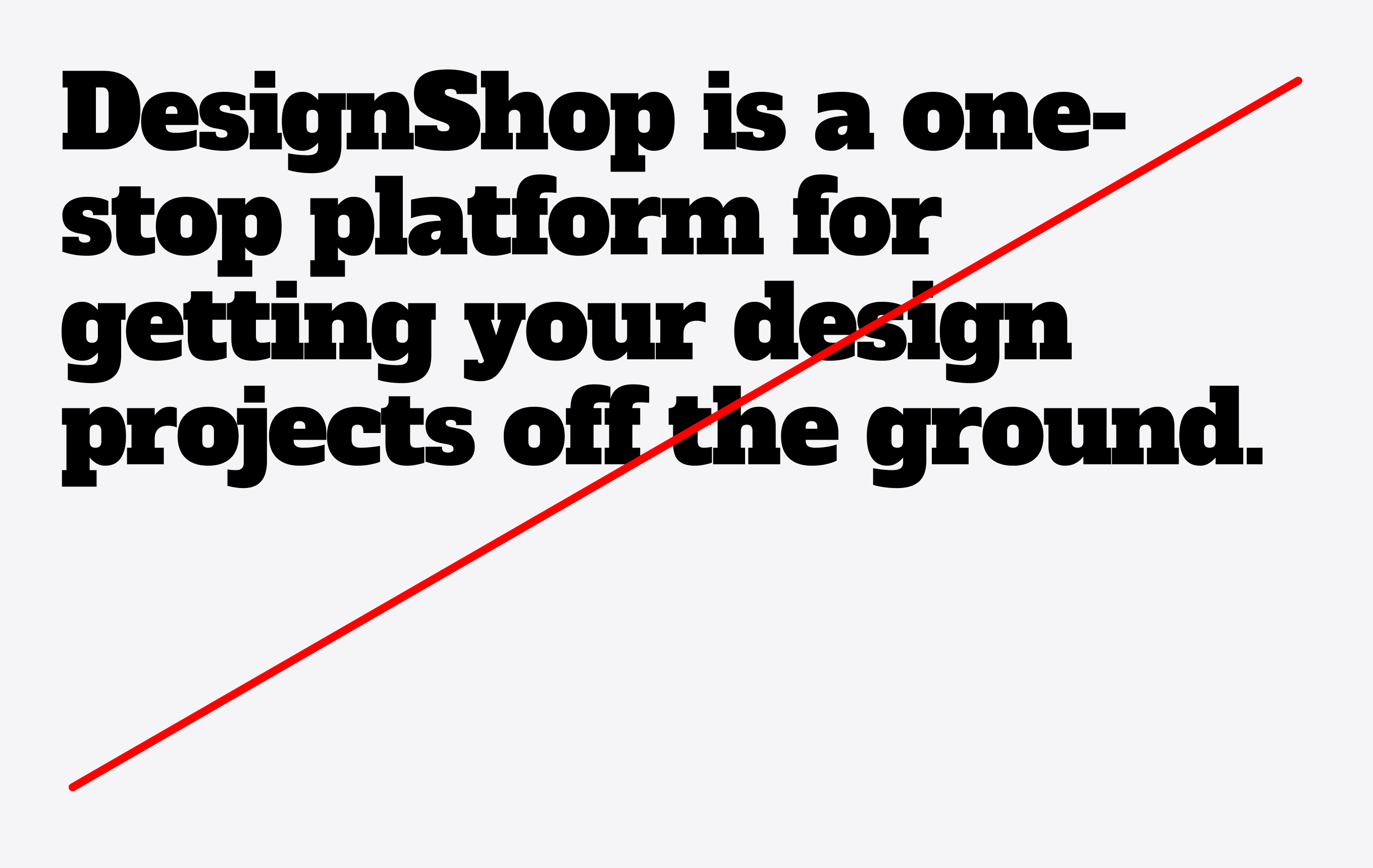
1. Do not use an alternative typeface.
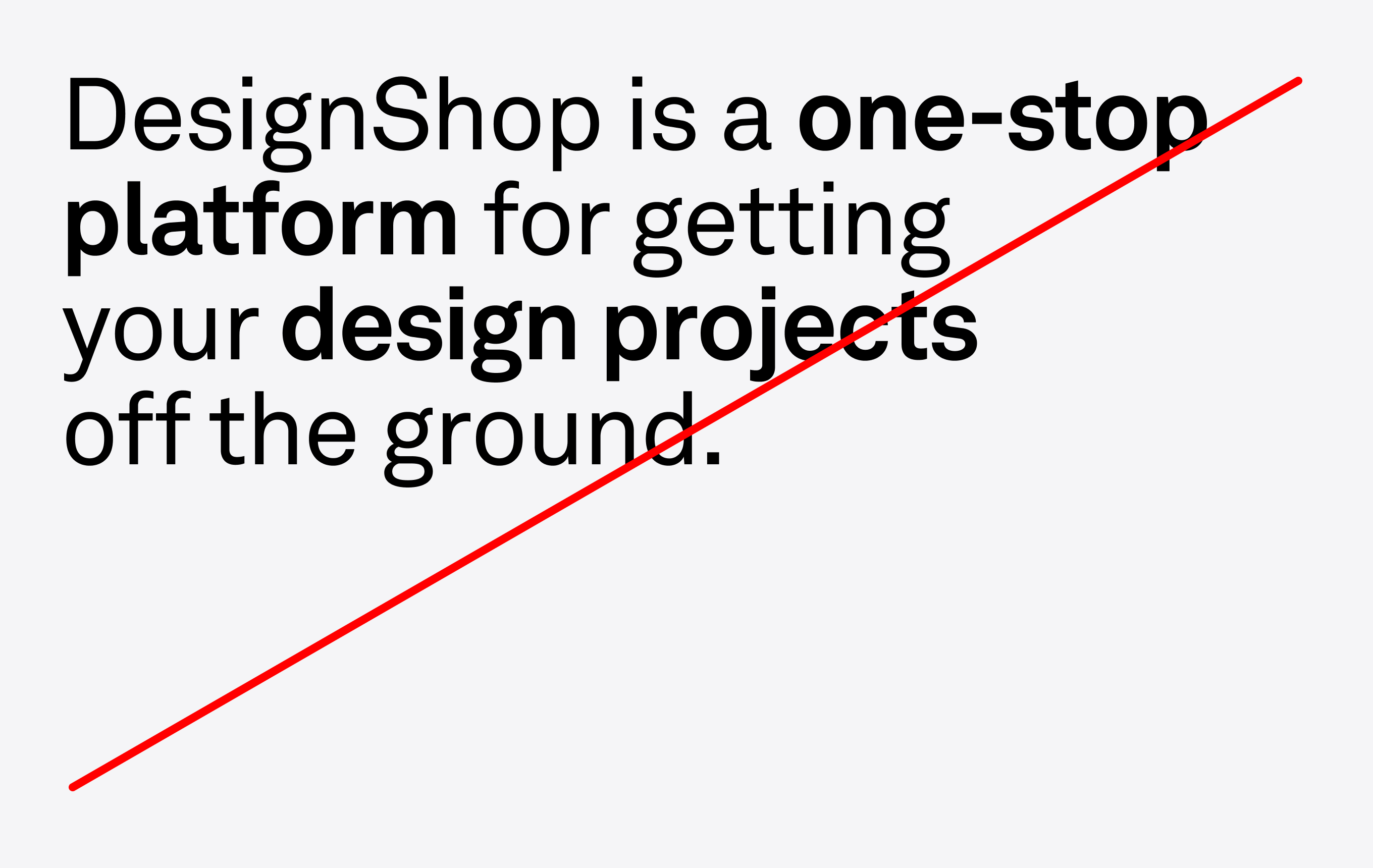
2. Do not combine weights in the same block of copy.
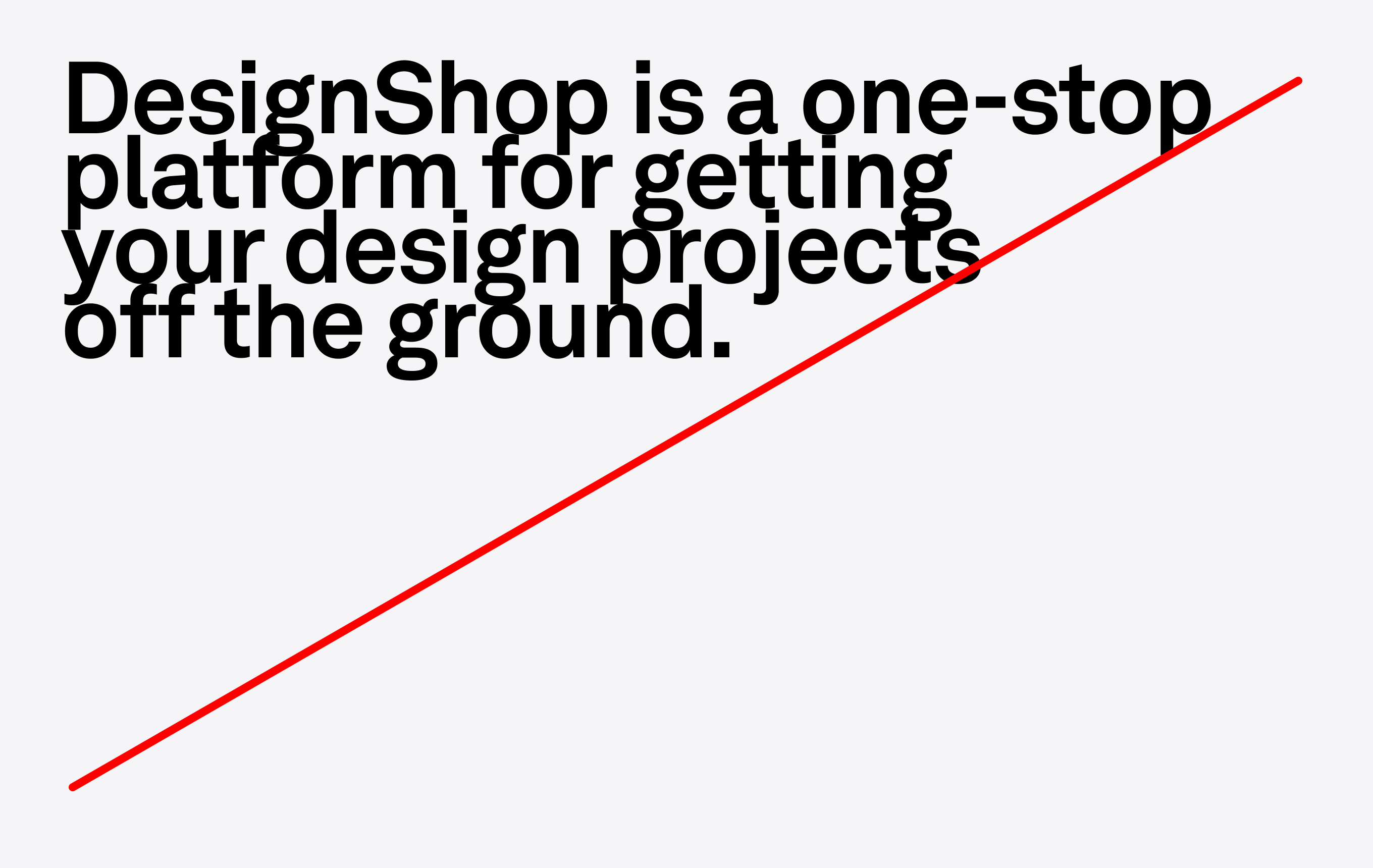
3. Do not let ascenders and descenders touch.
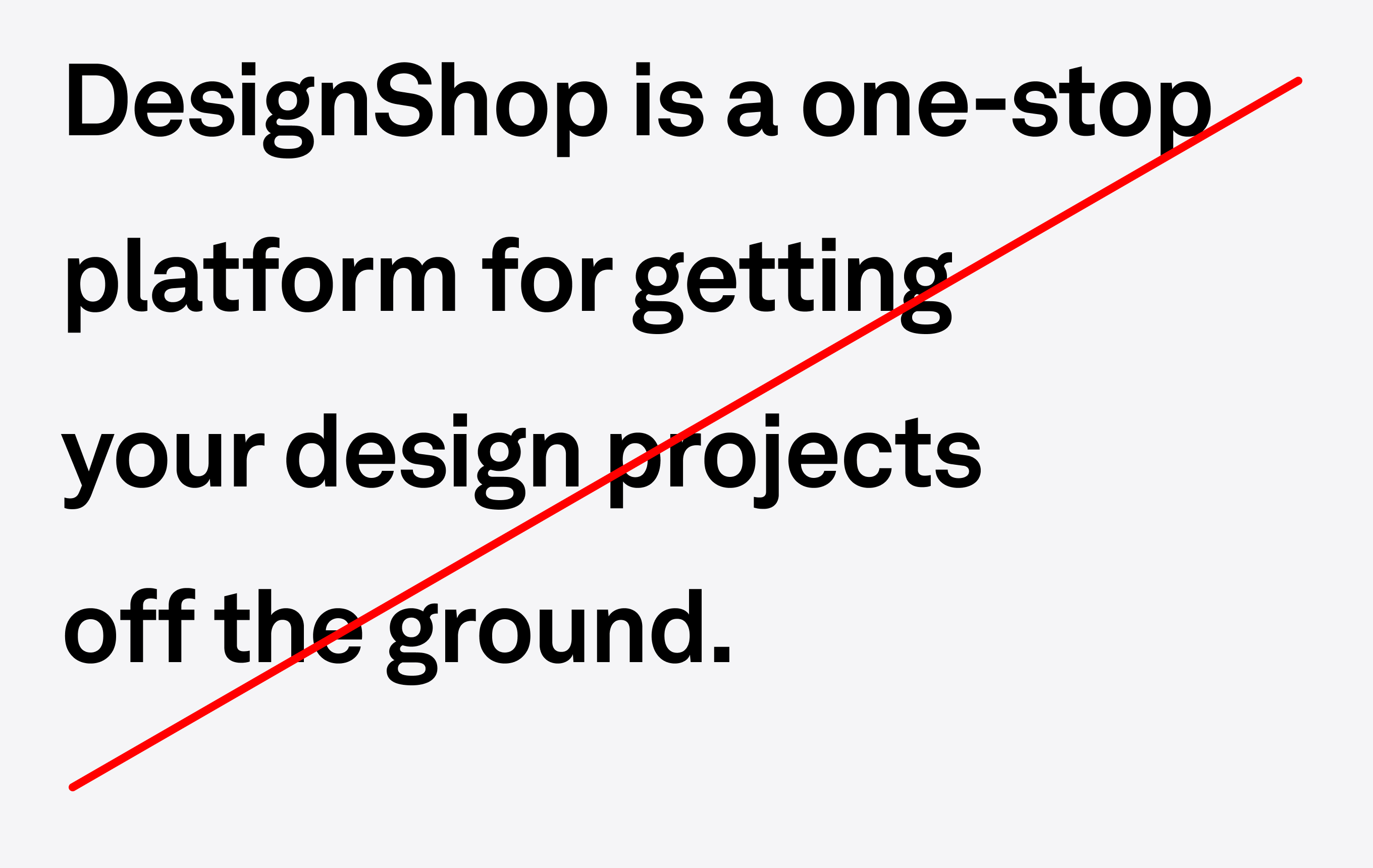
4. Do not justify type vertically.
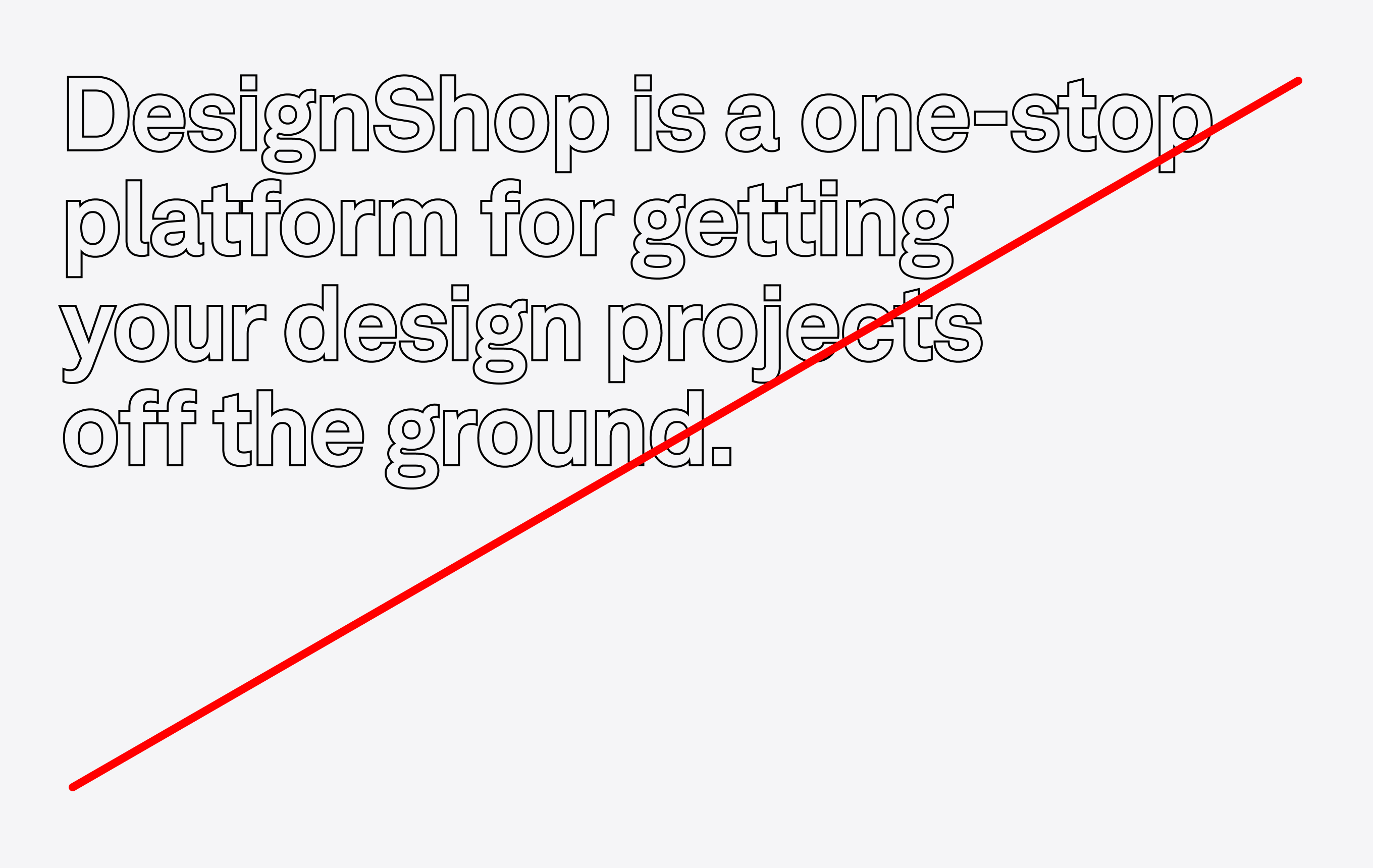
5. Do not outline typography.
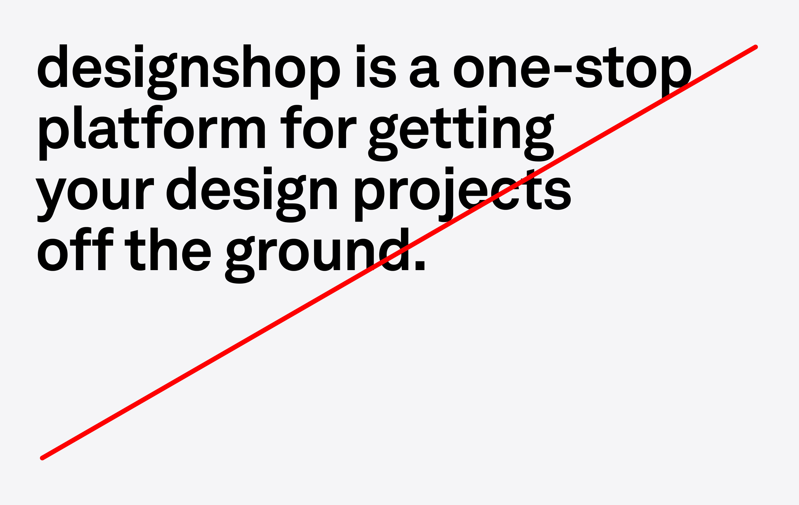
6. Do not set all lowercase.
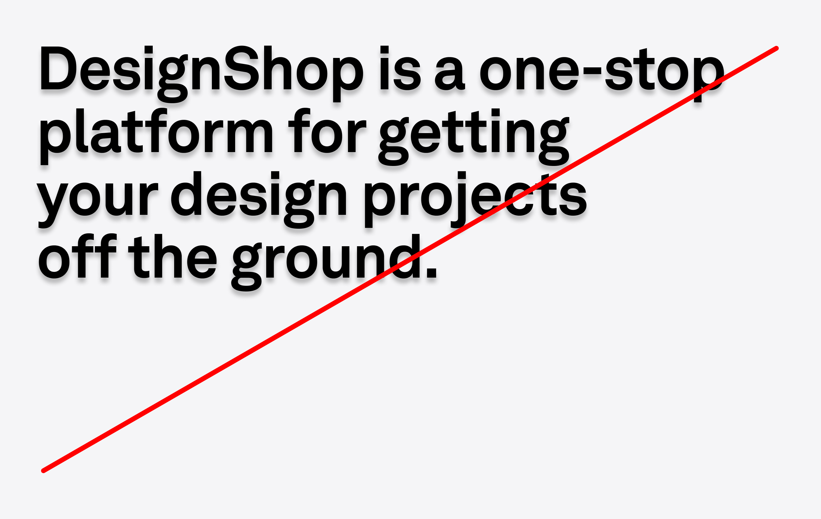
7. Do not apply drop shadows to type.
Type hierarchy
Scale
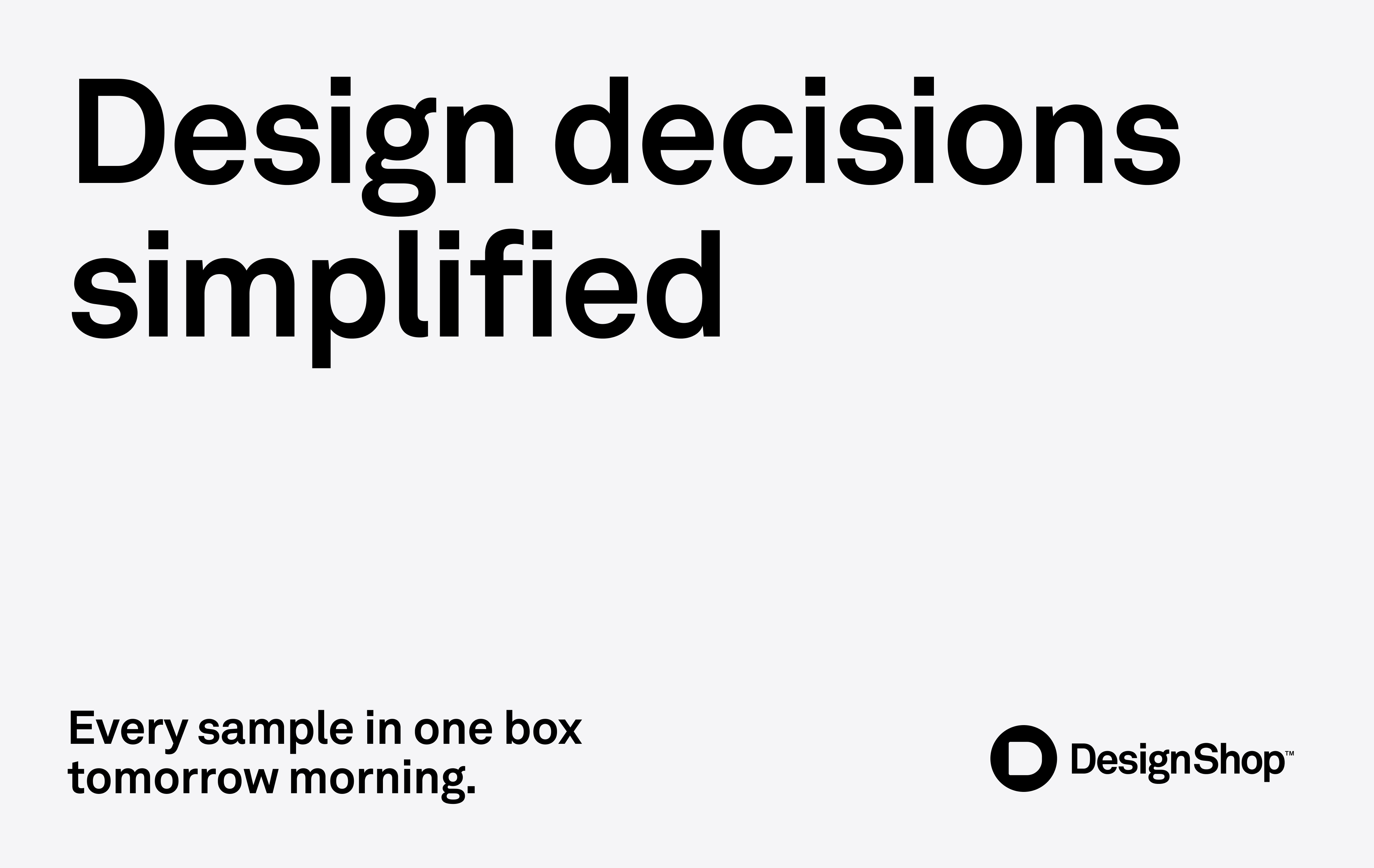
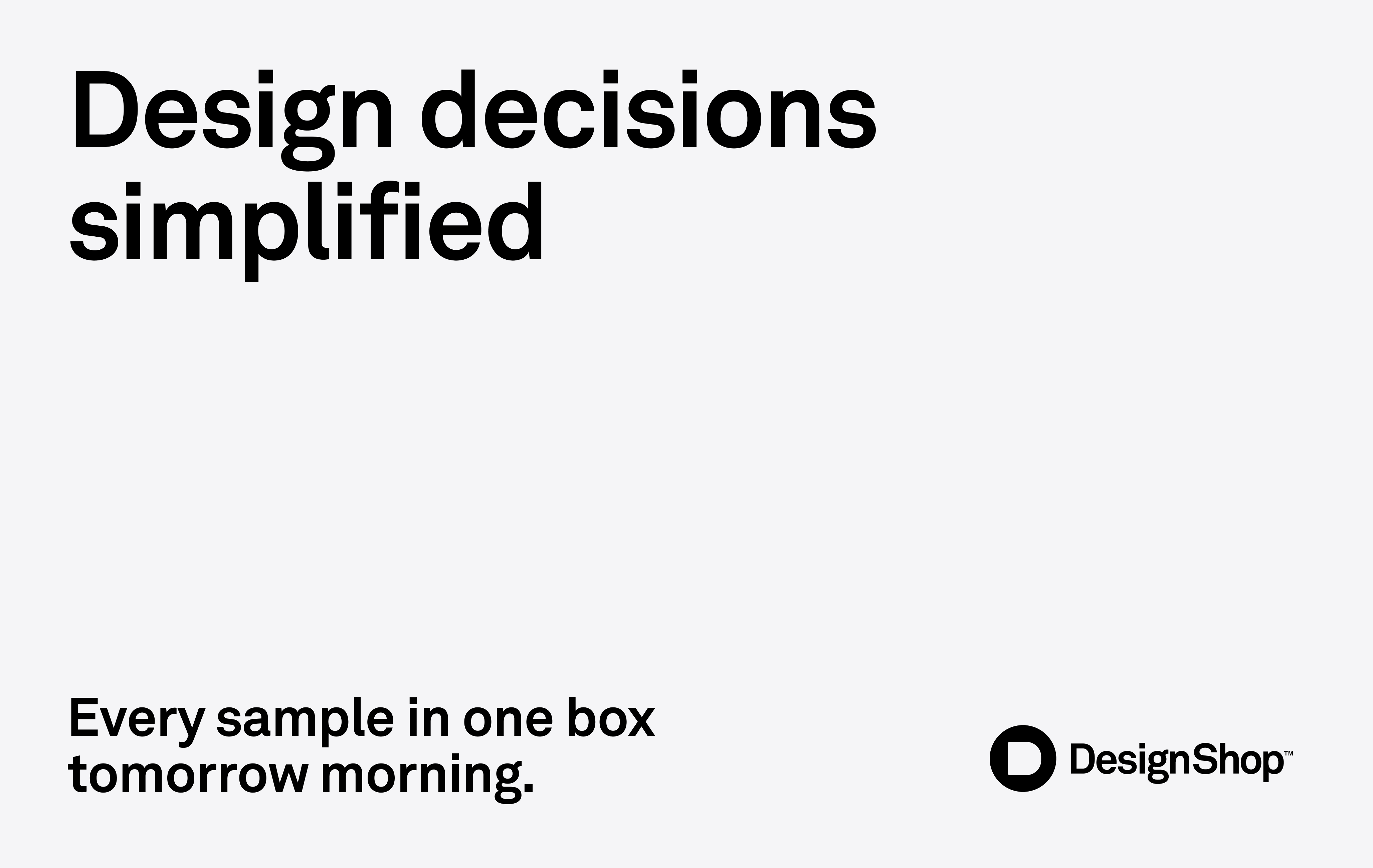
In order to keep things simple, no more than three type sizes should be used in one communication piece. These sizes follow a simple formula: each type size should aim to be a minimum of 50% larger than the preceding type size.
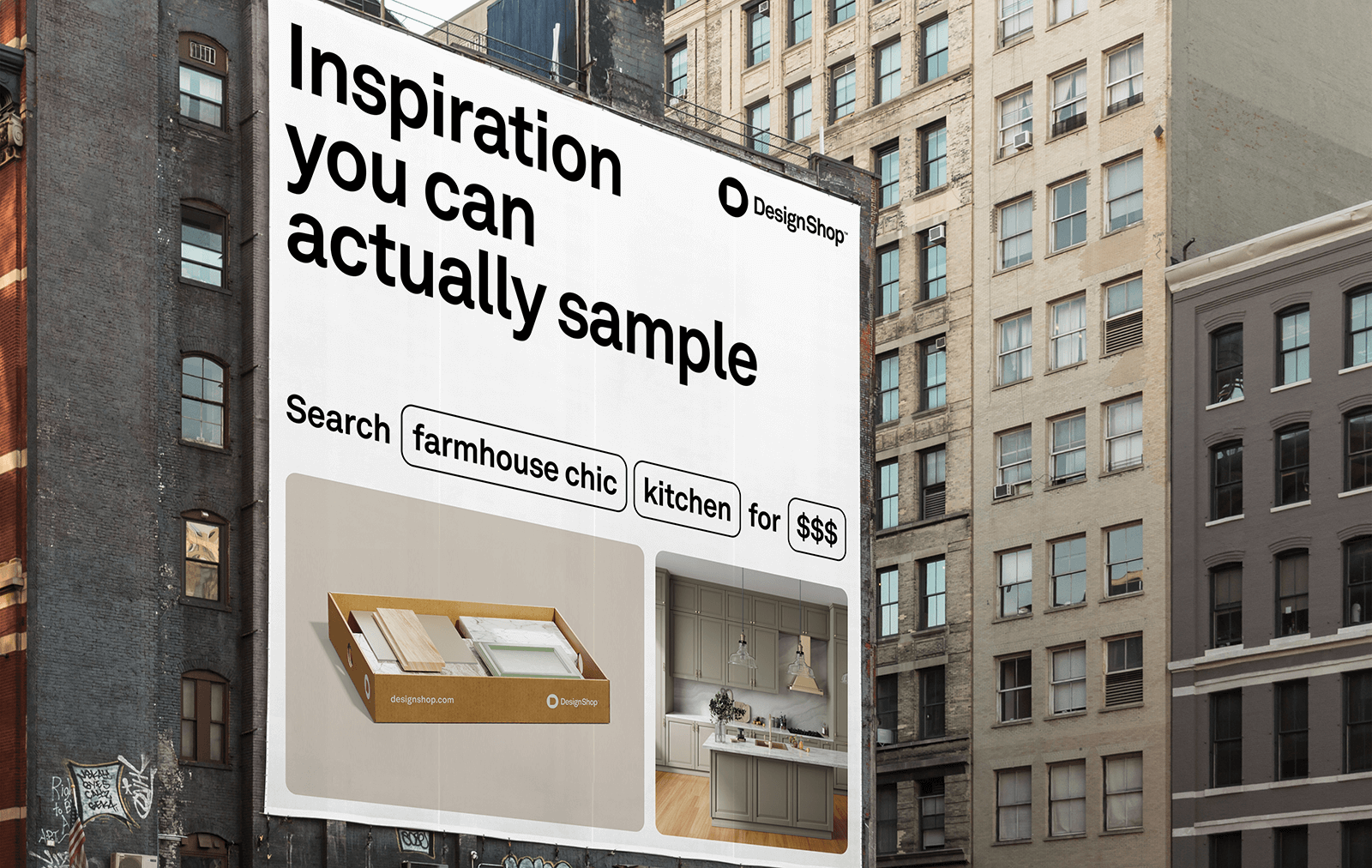
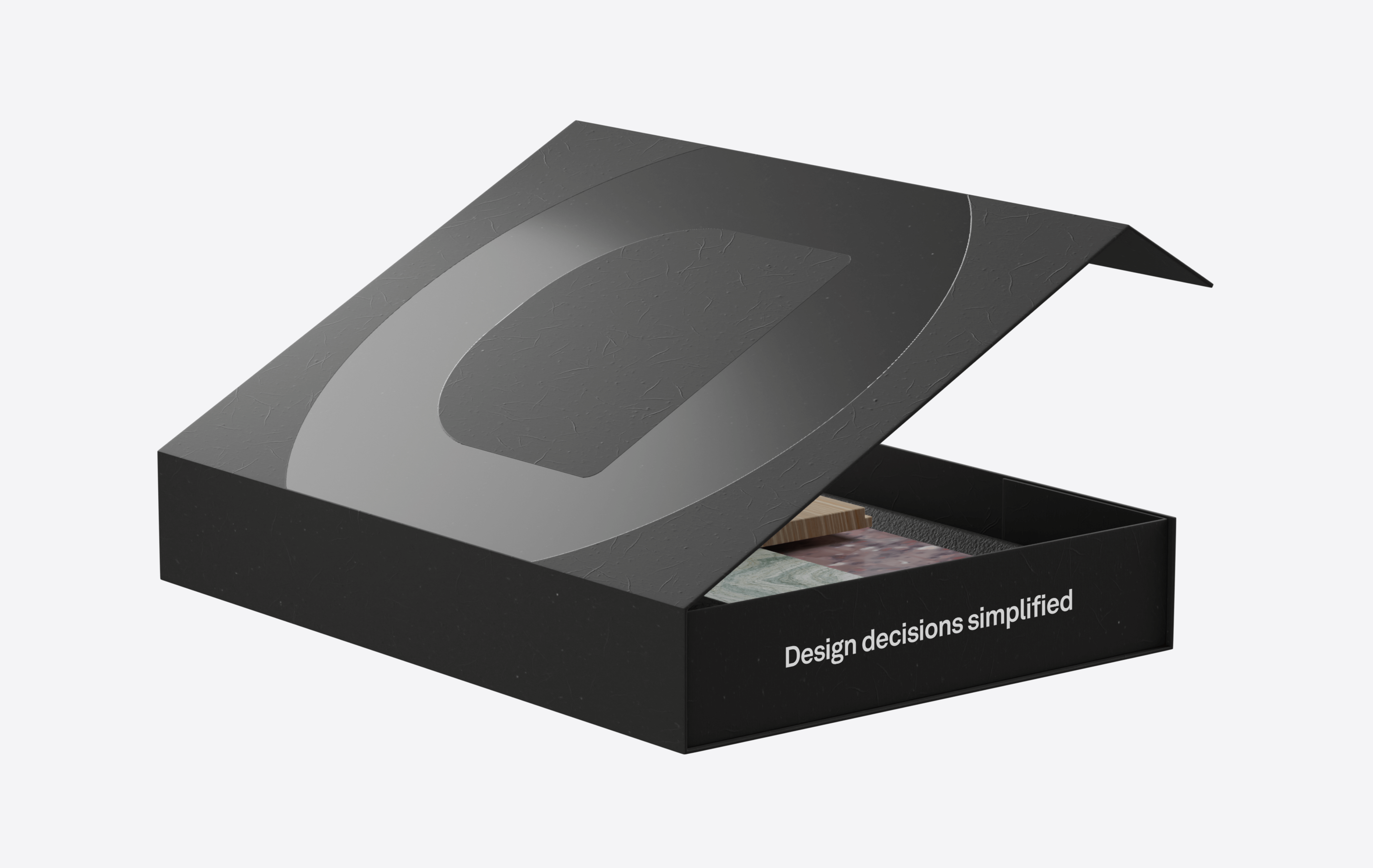
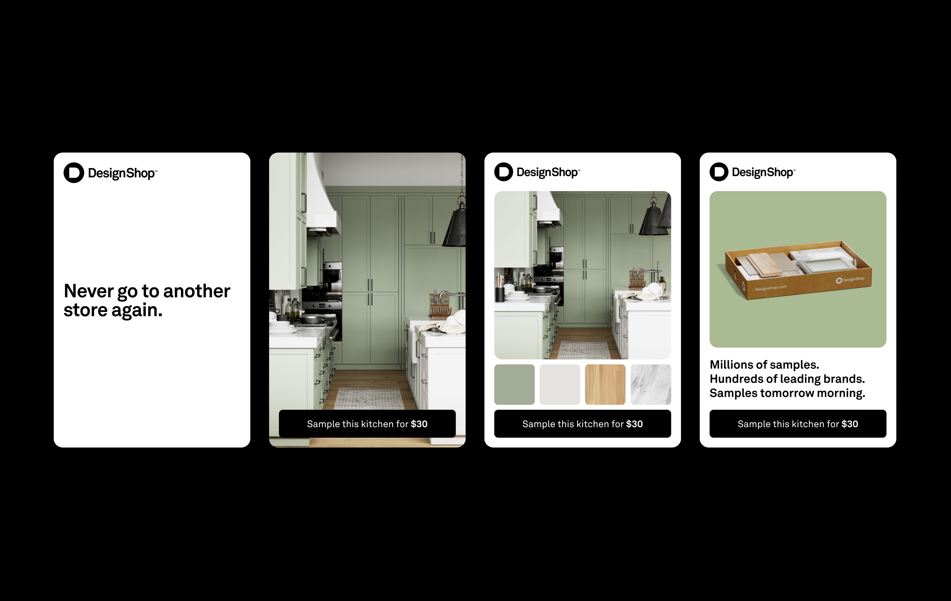
Application examples
Setting type
Fallback
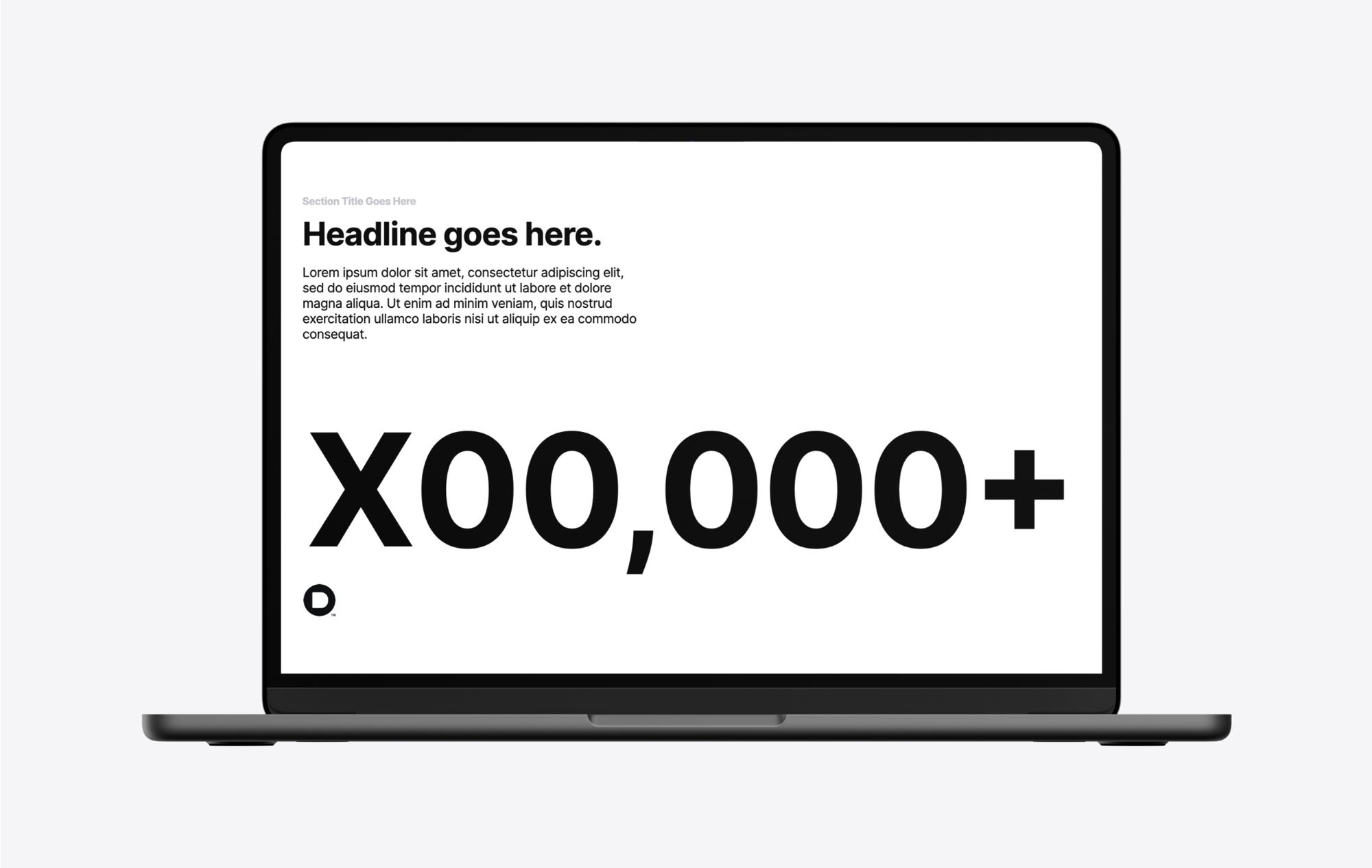
When Akkurat is not available for use, such as in Google Slides, Inter should be used as a replacement.
Akkurat Regular → Inter Regular
Akkurat Bold → Inter Bold
