Logo
Logo
Our logo is one of our most recognizable brand elements. We make it look iconic in any context with consistent placement, clear space, and color treatment.
Horizontal version

Square version

Clearspace
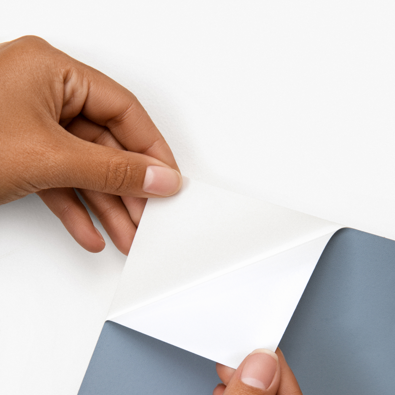
Our logo needs breathing room so it can stand out. To create the right distance from margins and other graphic elements, we use clear space proportional to the peeled-up corner of our logo.


Scalability
We designed our logo to work at many scales. But going too small can affect legibility, so we keep the logo height to a minimum of 20px.

Color
We use black, white, and dynamic colors adapted from real paint brands. When placing our logo over images, we make sure there’s enough contrast to keep it looking clear and crisp.
Logo on Color


Logo on Image


Misuse
Our logo stays consistent no matter where it goes. Whether it’s re-scaling elements or misapplying color, we never modify, embellish, or reinterpret our wordmark.


Placement
To keep things simple yet flexible, we maintain a tight set of options for logo placement. This lets us work with a variety of visuals while creating consistency across our communications.
Placement Options. Horizontal Logo

Placement Option. Square Logo

Icon Shapes
When it comes to our logo icon, we let context be the guide. Icons can have a black or colored field and be circular, square, or have rounded corners.
Color of the Background Can Be Dynamic
